

Allways Think Fresh

POS Guide, Website and Brochure
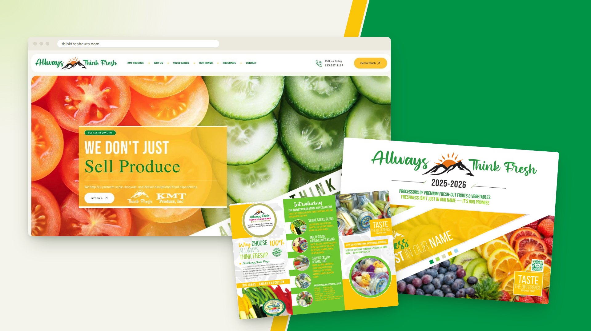
Allways Think Fresh is the value-added division of KMT Produce in Los Angeles, cutting and packing fresh fruit and vegetables for retail and foodservice buyers. We designed the sales kit those buyers see: a point-of-sale guide, a trifold brochure for the new veggie cup line, and the website at thinkfreshcuts.com.
The three pieces share one kit of parts. The guide gives a buyer the pack, case and shelf-life numbers for every item, the trifold launches a new line on a single sheet, and the site carries the same message and offers the guide as a download.
The route
How this project climbed.
- 02Blueprint Base Camp
The product line sorted into programs, and what a buyer needs from each page: pack, case and shelf life.
- 03Moodboard Meadow
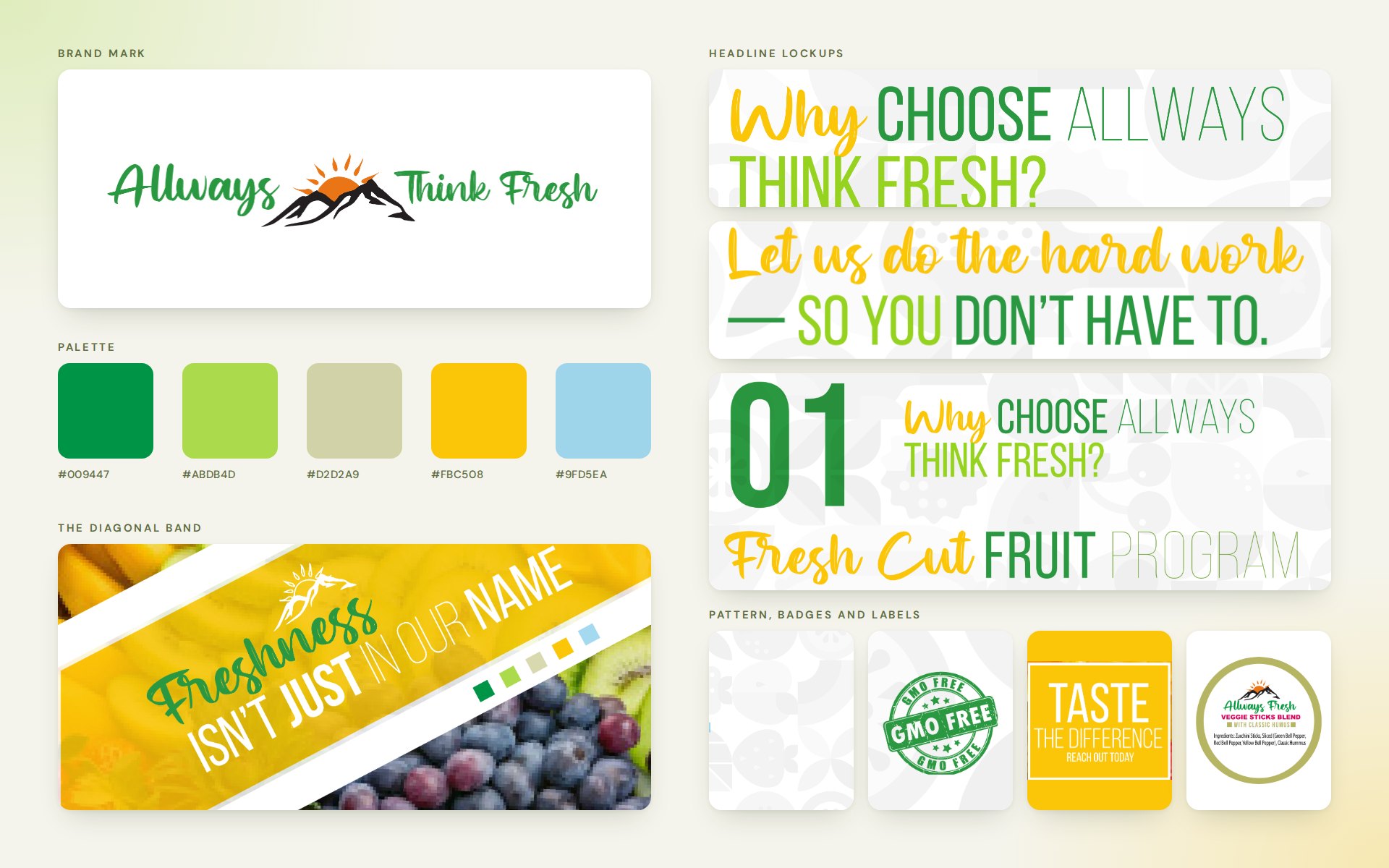
A kit of parts: the wordmark, five colors, a brush script with condensed capitals and a diagonal band.
- 04Wireframe Switchbacks
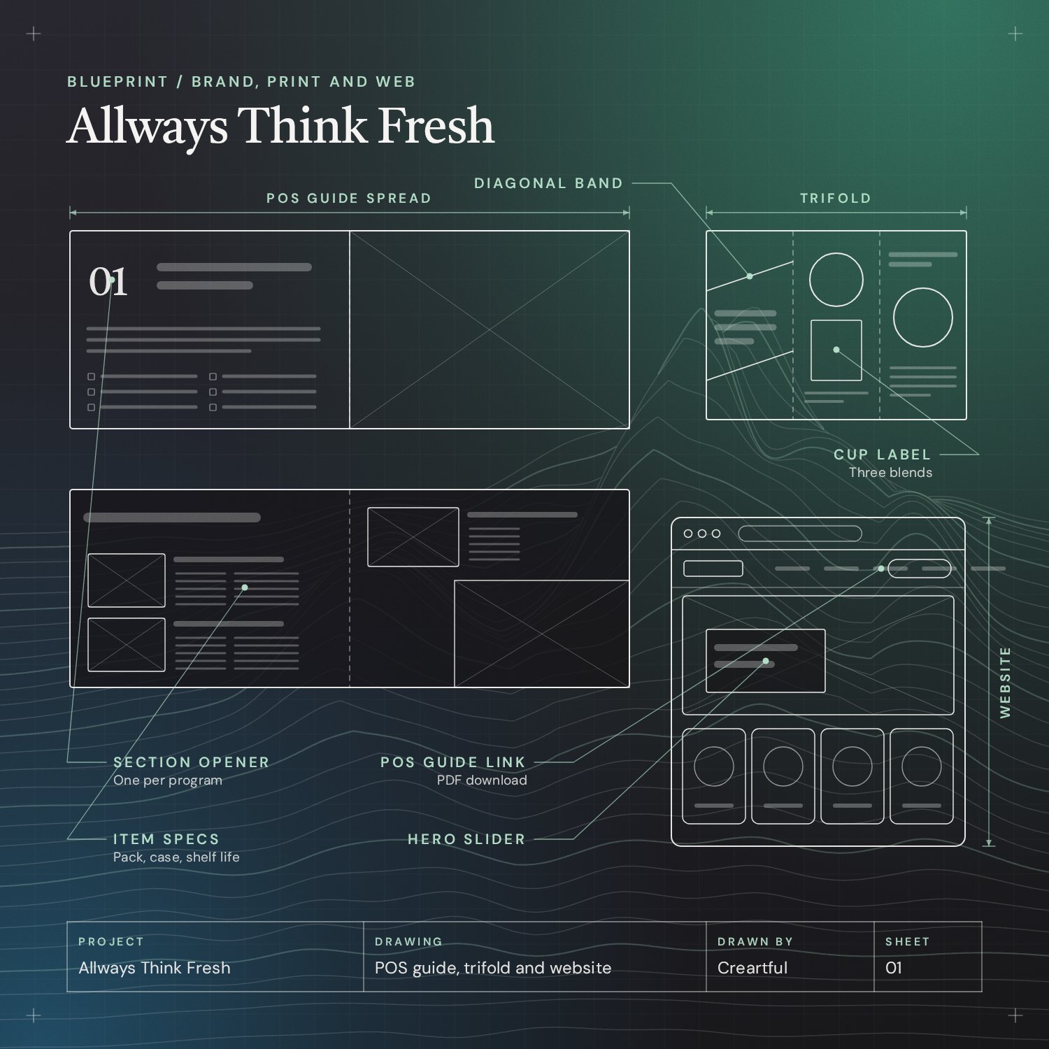
One item layout for the guide, three panels for the brochure and a home page ordered like a sales call.
- 05Commit Ridge
The guide built in InDesign, the trifold in Illustrator and the site on WordPress.
- 08Go-Live Summit
The site is live at thinkfreshcuts.com, with the POS guide as a download in its menu.
Task
Allways Think Fresh sells to buyers who compare suppliers on specifics. Its materials had to do two jobs at once: present a fresh-cut produce brand people would want on their shelves, and give a purchasing team the case pack, shelf life and pallet numbers for every item without a phone call. The challenge was to design one system that could hold a long product list in print, launch a new line on a single sheet, and carry the same message on a website.
Allways Think Fresh is the value-added division of KMT Produce in Los Angeles. It cuts, packs and delivers fresh fruit and vegetables to grocers, restaurants, schools and other foodservice buyers. Those buyers need two things from a supplier’s materials: a reason to call, and the numbers to place an order. We designed a point-of-sale guide, a trifold brochure and a website that give them both.
The three pieces were designed as one kit. The same wordmark, colors, headline style and diagonal band run through all of them.
Project Overview

The Brand Kit
Everything starts from the wordmark: green script lettering around a mountain sunrise. Around it sit five colors (two greens, a yellow, a sand and a sky blue), a pattern of fruit and vegetable shapes for page backgrounds, and a headline style that mixes a brush script with tall condensed capitals. A diagonal band carries the promise line, “Freshness isn’t just in our name”, across covers and panels.
POS Guide
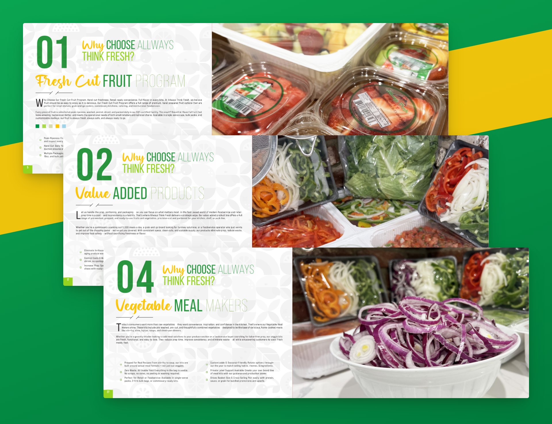
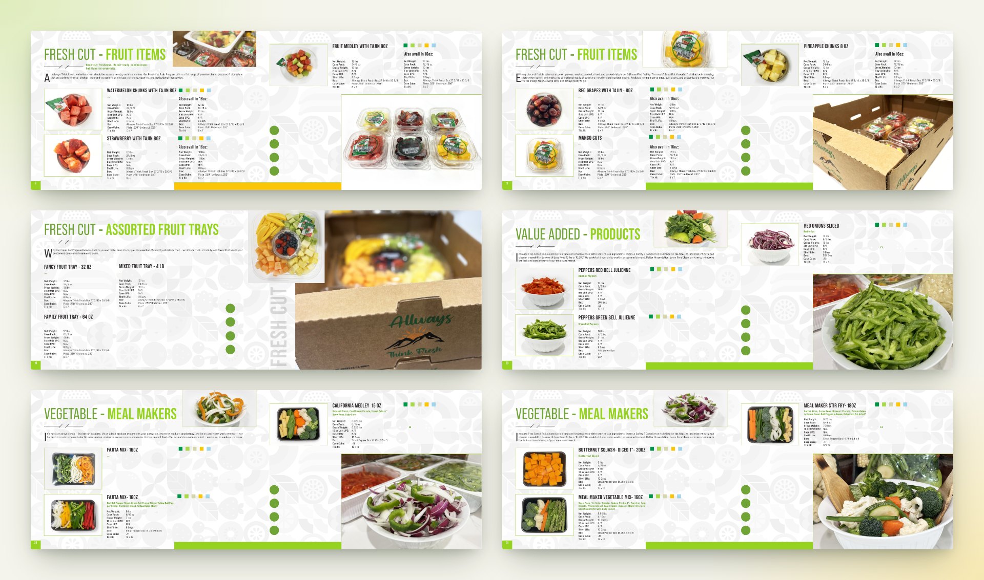
The guide for 2025 and 2026 opens with the company, its six programs and its food safety program, then moves through the product line. Each program has a numbered opener with a full-page photo and the reasons to buy.
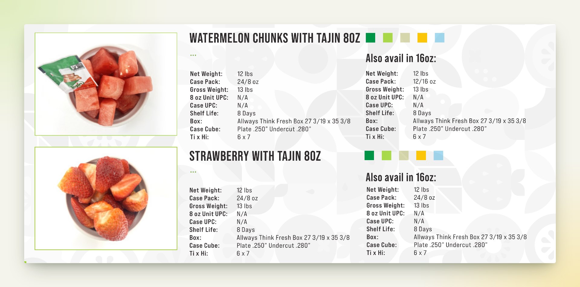
The item pages are built for a buyer filling in an order. Every product has a photo and a table in the same place on the page: net weight, case pack, gross weight, UPCs, shelf life, box size, case cube and pallet pattern. Where a second size exists, its numbers sit alongside.
Veggie Cup Trifold
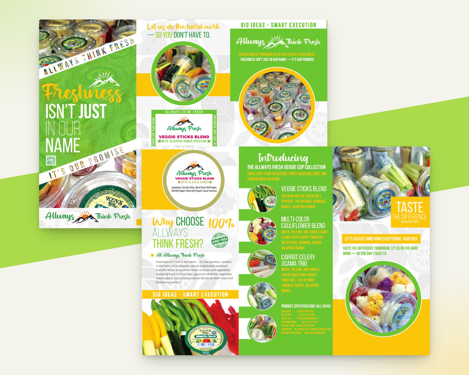
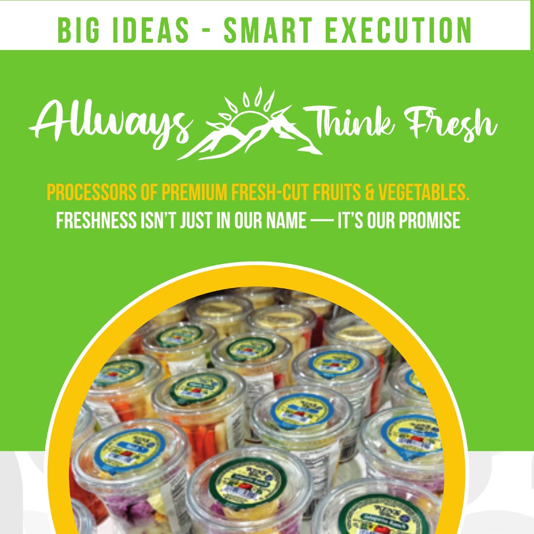
The trifold introduces a new line, the veggie cup collection: three vegetable blends, each with a choice of hummus, ranch or jalapeño ranch. The outside sells the idea, with the cup label at its center. The inside lists the three blends with photos and one specification table that covers every SKU.


Website
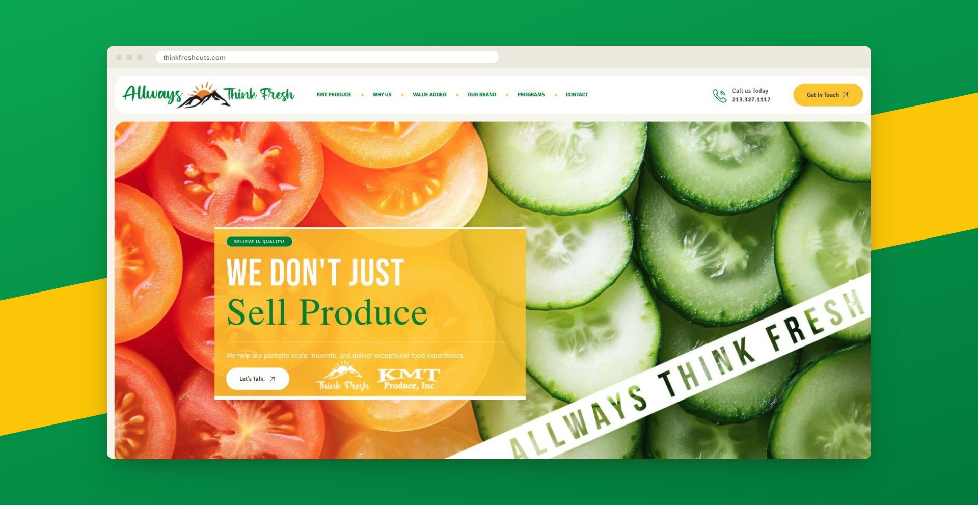
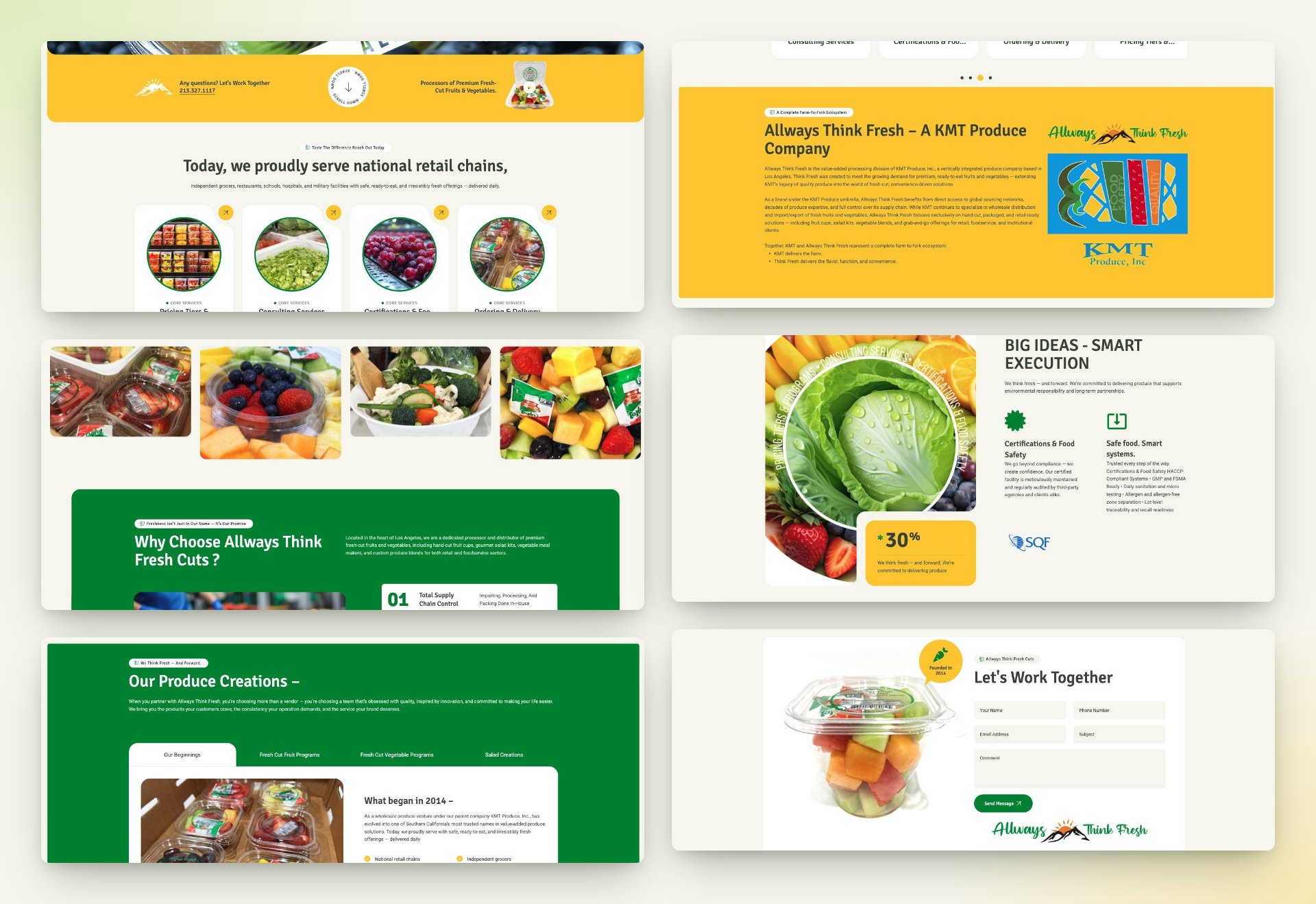
The website at thinkfreshcuts.com is built on WordPress. The home page follows the order of a sales call: who the company is and its place within KMT Produce, the core services, why buyers choose it, certifications, then the programs. The POS guide is a download in the main menu, and a contact form closes the page.