
Haus 575

Brand and Logo Discovery
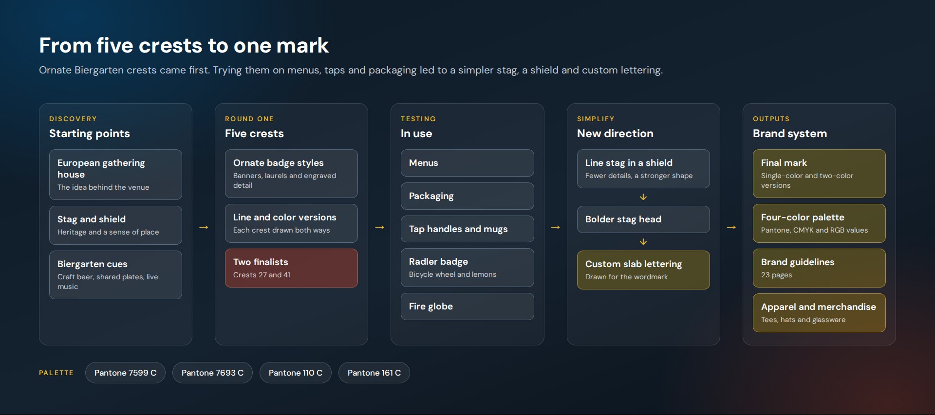
Haus 575 is a Biergarten conceived as a modern gathering house, inspired by European beer gardens. We ran the logo discovery from a first round of five ornate crests to the final mark: a stag in a shield with custom slab lettering.
The leading designs were tried on menus, tap handles, packaging and merchandise along the way. The finished identity comes in single-color and two-color versions, with a four-color palette and a 23-page brand guide.
The route
How this project climbed.
- 02Blueprint Base Camp
The brief: a European gathering house, with a stag and a shield as starting points.
- 03Moodboard Meadow
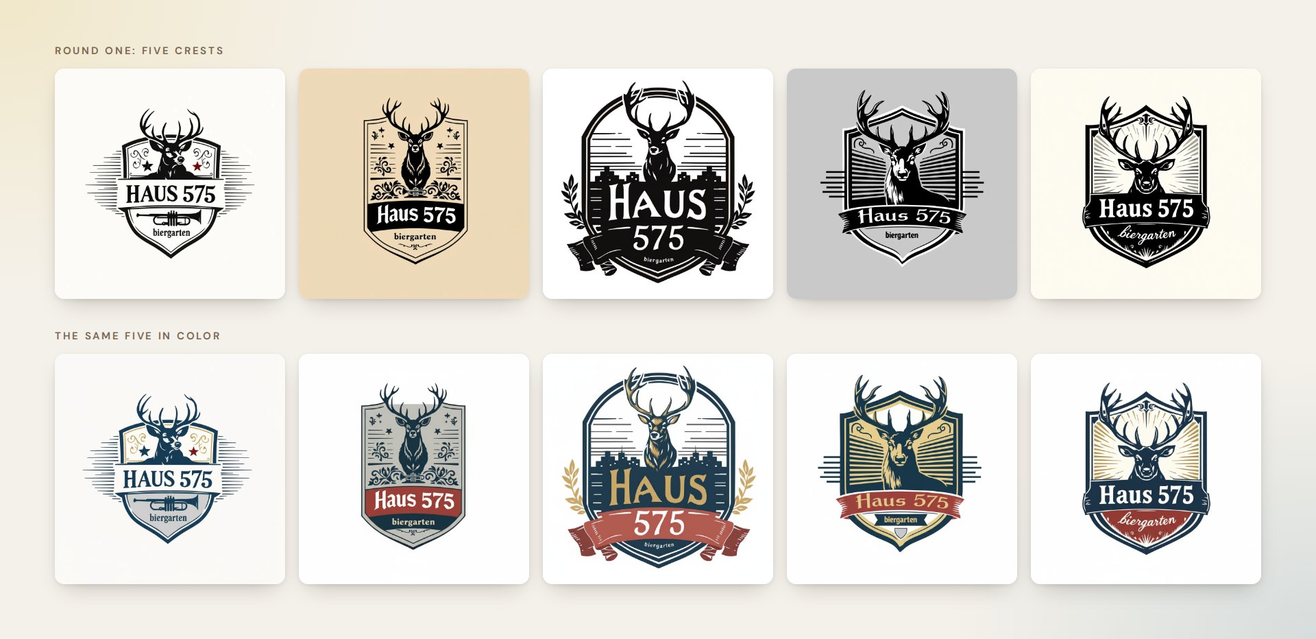
Five ornate crests, each drawn in line and in color.
- 04Wireframe Switchbacks
Two finalists revised and tried on menus, packaging, tap handles and a fire globe.
- 05Commit Ridge
A simpler mark: a bold stag, a shield and custom slab lettering, drawn as vector artwork.
- 08Go-Live Summit
The final logo in nine colorways, a four-color palette and a 23-page brand guide.
Task
Haus 575 needed an identity that could carry European Biergarten heritage without looking like a costume. The mark had to hold up at every size a venue uses it: etched on a stein, stitched on a hat, printed on a menu and shown as a small icon on a screen. The challenge was to explore the traditional end of that brief fully, then find the simplest mark that kept its character.
Haus 575 is a Biergarten conceived as a modern gathering house: craft beer, shared plates and live music in a setting inspired by European beer gardens. It needed a mark that felt rooted in that tradition and still worked on a tap handle, a hat and a phone screen. We ran the discovery from the first round of ideas to a finished identity and a set of brand guidelines.
Project Overview
Round One: Five Crests
The first round explored the classic end of the brief. Five crests, each built around a stag, tried different amounts of ornament: banners, laurels, engraved shading, a skyline, a trumpet. Each was drawn in black and white first, then in color.
Two Finalists
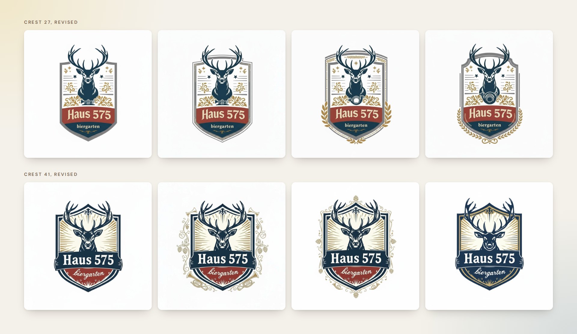
Two crests went forward, numbered 27 and 41 in the working files. Each went through its own rounds of revision: the balance of color, the weight of the lettering, and how much ornament to keep around the shield.
Trying Them in Use
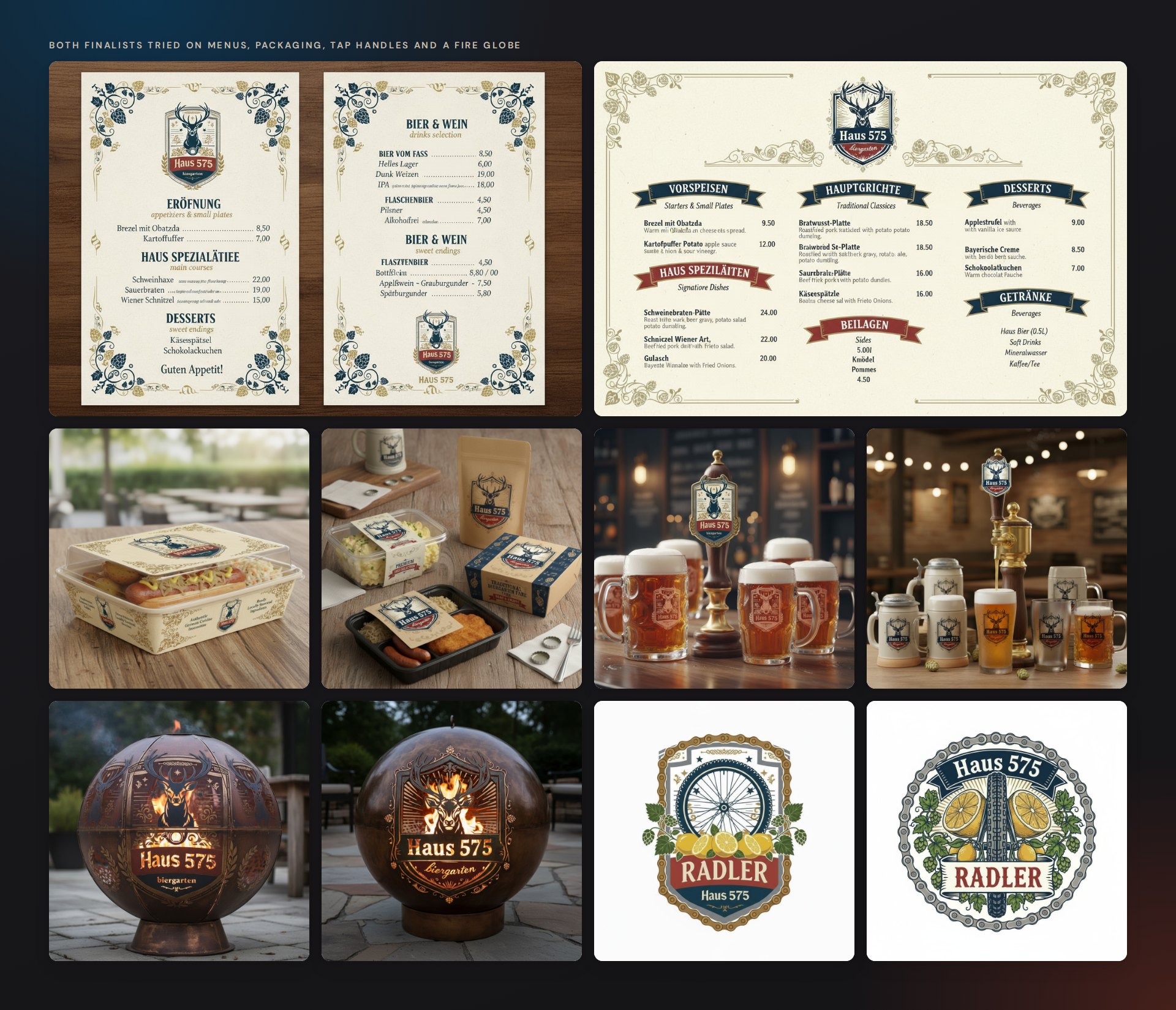
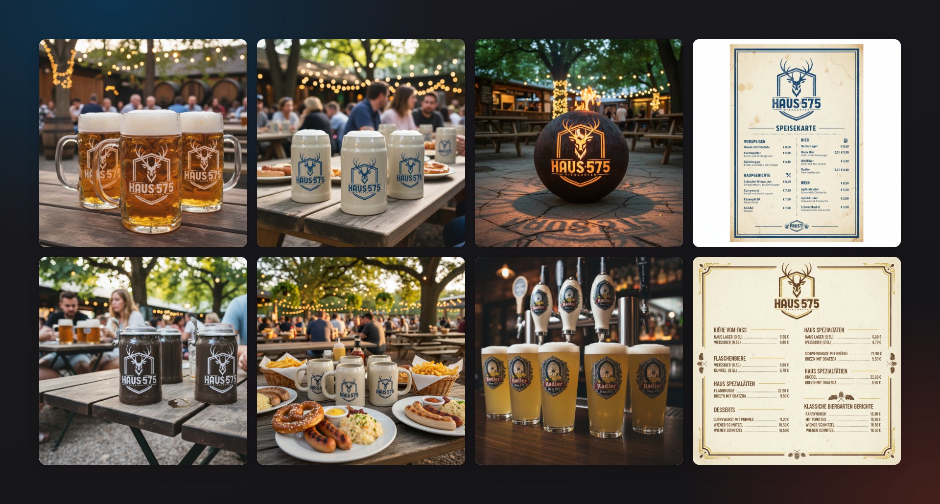
A logo for a venue lives on objects, so both finalists were mocked up where they would appear: menus, takeaway packaging, tap handles and mugs, a fire globe and a badge for a Radler. These are concept renderings, made to judge the marks at working size before anything was produced.
A Simpler Direction
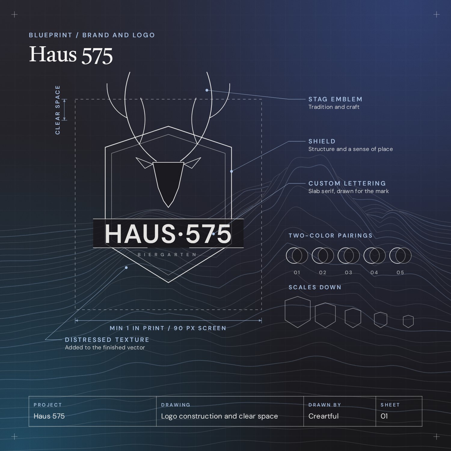
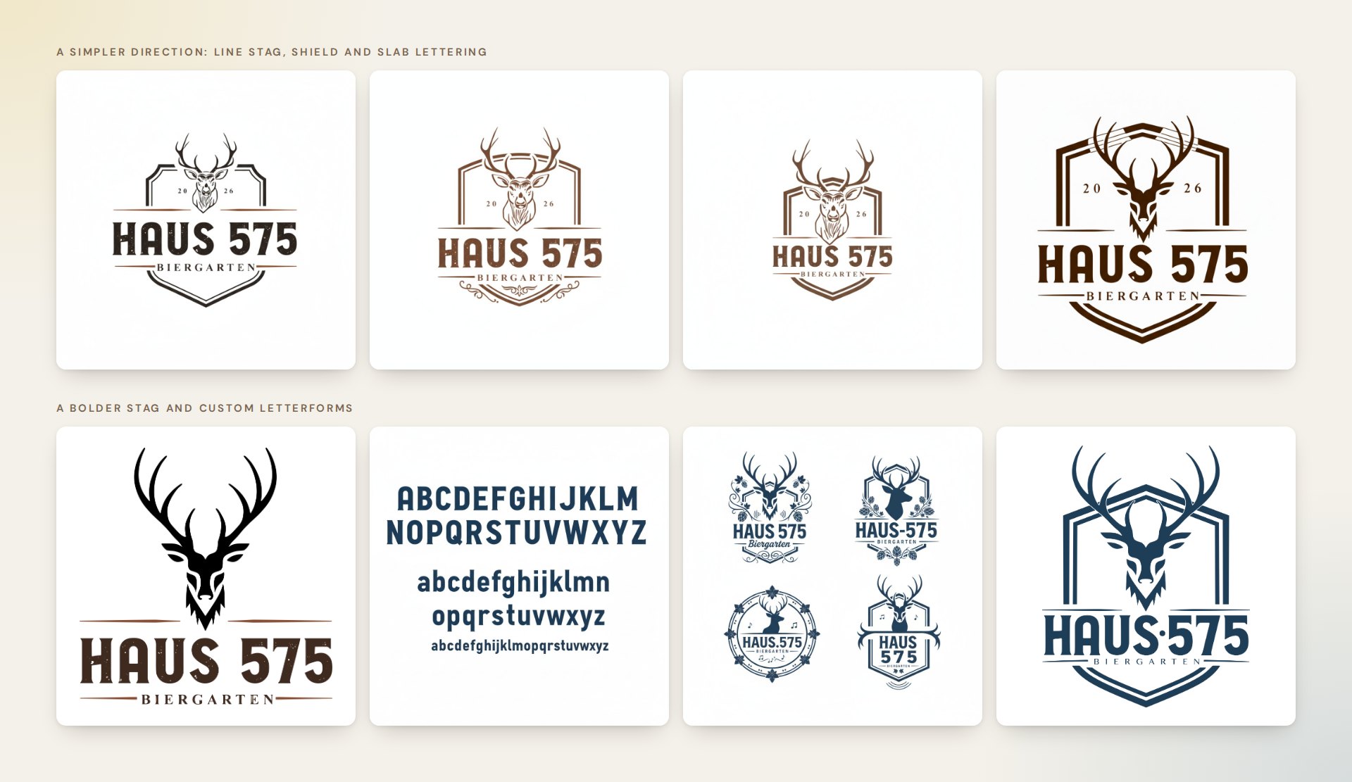
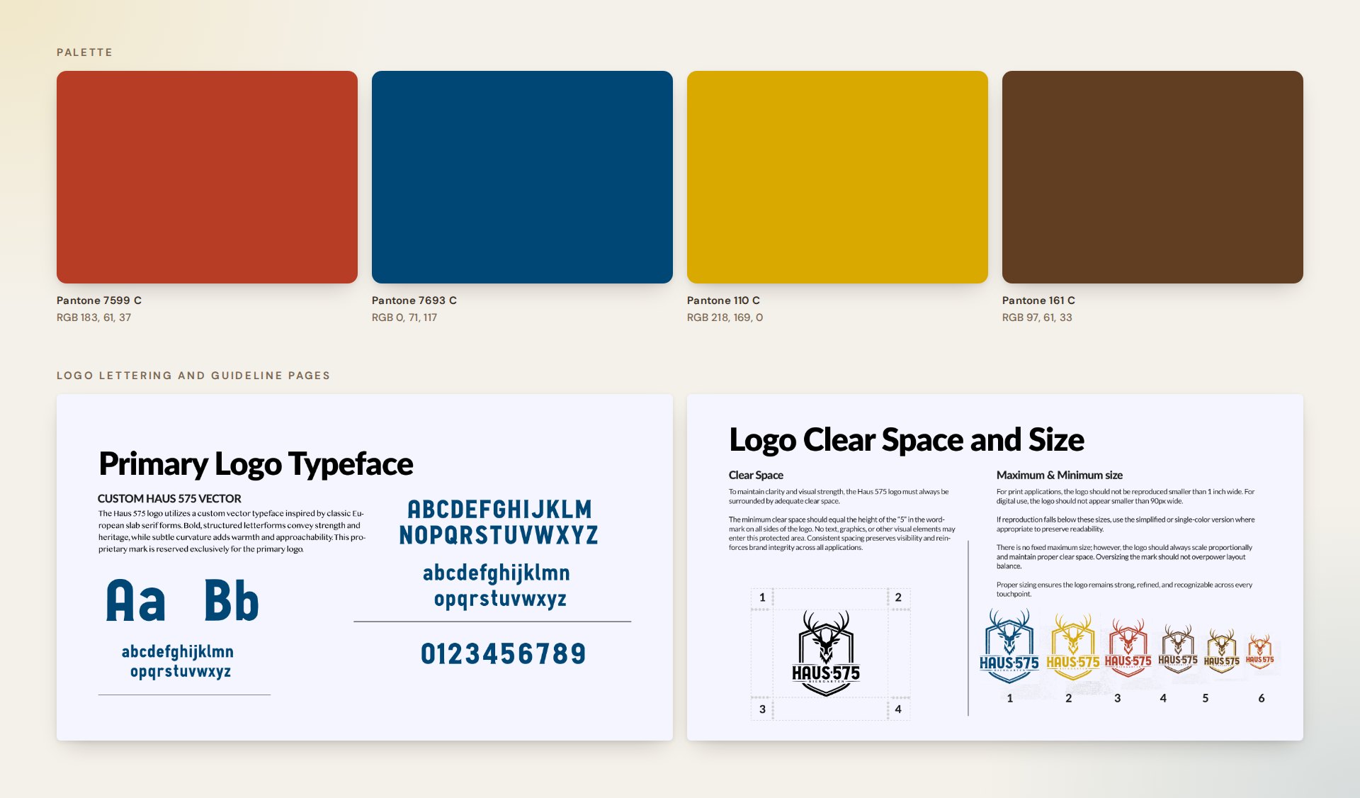
The next round stripped the crest back to three parts: a stag’s head, a shield and the name in slab capitals. From there the stag became bolder, and the lettering was drawn as custom letterforms for the wordmark, with an alphabet and numerals to match.
The Final Mark
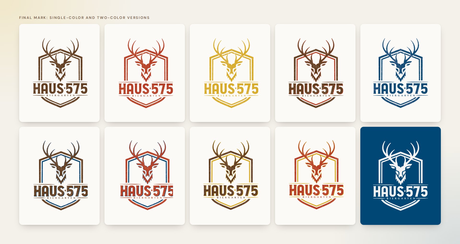
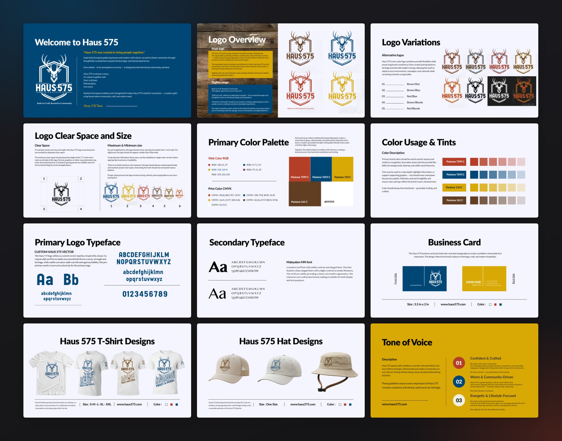
The final logo sets the stag above the wordmark, with its antlers breaking out of the shield. It comes in four single-color versions and five two-color pairings. A light distressed texture gives the flat vector some of the warmth of print on wood and glass.
Color and Type
The palette is four colors, each specified in Pantone, CMYK and RGB: red, blue, blonde and brown. The two-color logo versions are built from pairs of them. The custom lettering is reserved for the logo, and the guidelines set a secondary serif for everything else.
Brand Guidelines
The identity is documented in a 23-page guide: logo use, clear space and minimum sizes, color, typography, stationery, apparel, photography style and tone of voice.
The Mark in Use
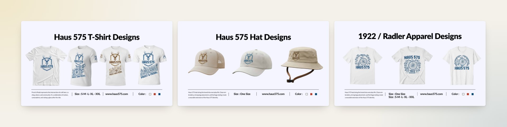
The guide closes with the mark in place: glassware and steins, menus in one and two colors, a fire globe, hats, and tee designs including Prost & Pedal and a 1922 Radler graphic. These are shown as concept renderings.