
Rainbow Foods
Boho Brand and Label System
Rainbow Foods makes plant-based, ready-to-eat meals in Redlands, California. As the range grew from a few entrees into a full line of power bowls, pastas and breakfast items, the packaging needed to look like one family. We developed the brand mark and a label system around it, then rolled that system out across the range.
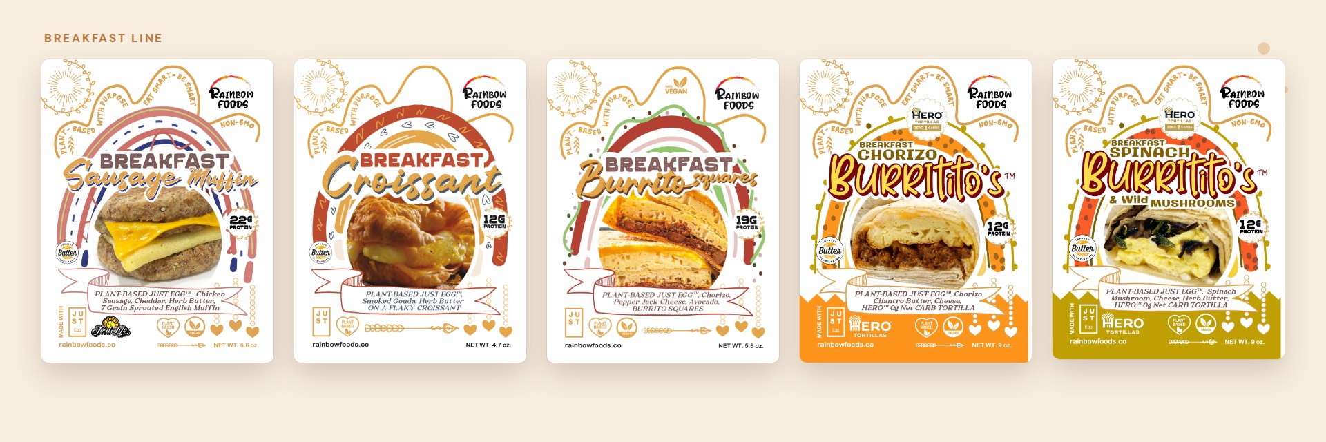
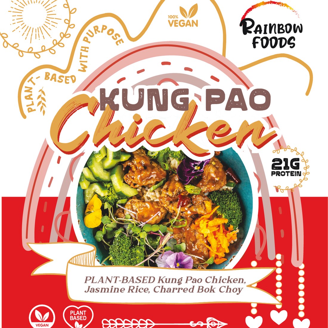
The look is boho and hand-drawn. Rainbow arches frame each dish, with sunbursts, vines and strings of dots and hearts around them. Script lettering sits over bold capitals for the product name, and each flavor gets its own color.
The route
How this project climbed.
- 02Blueprint Base Camp
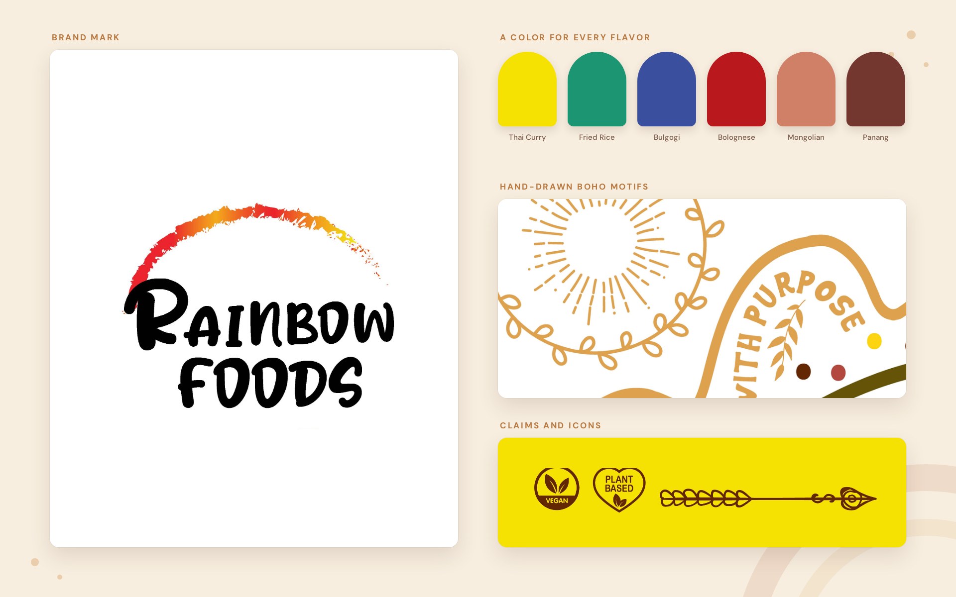
A hand-lettered logo and a kit of parts: rainbow arch, sunbursts, vines and icons.
- 03Moodboard Meadow
A color per flavor: yellow for Thai curry, green for fried rice, blue for the bulgogi bowl.
- 04Wireframe Switchbacks
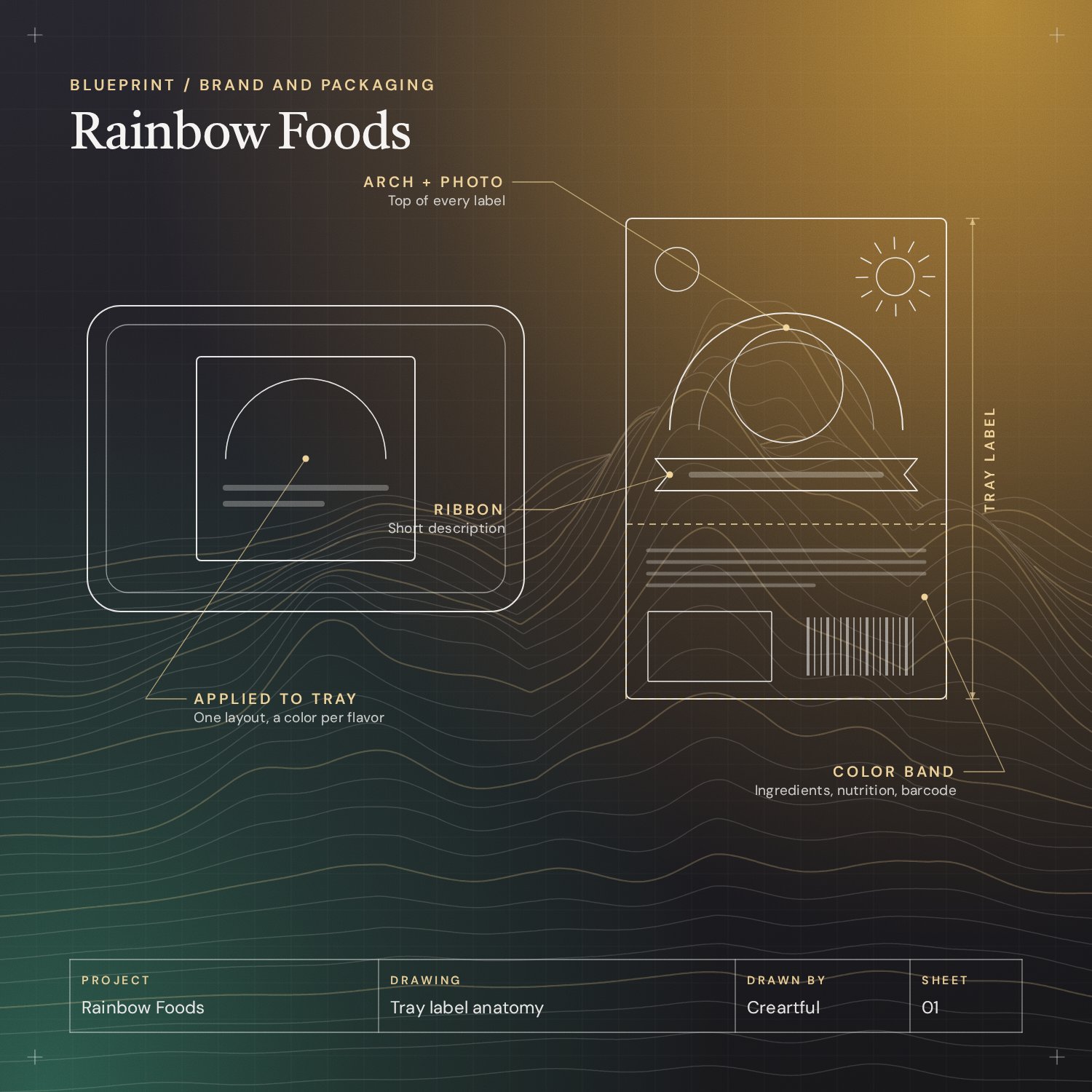
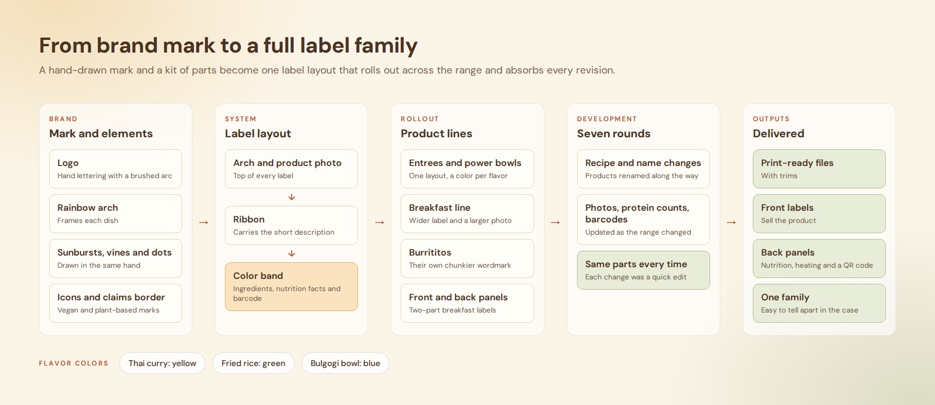
One label layout: arch and product photo, a ribbon, then a color band for ingredients, nutrition facts and barcode.
- 05Commit Ridge
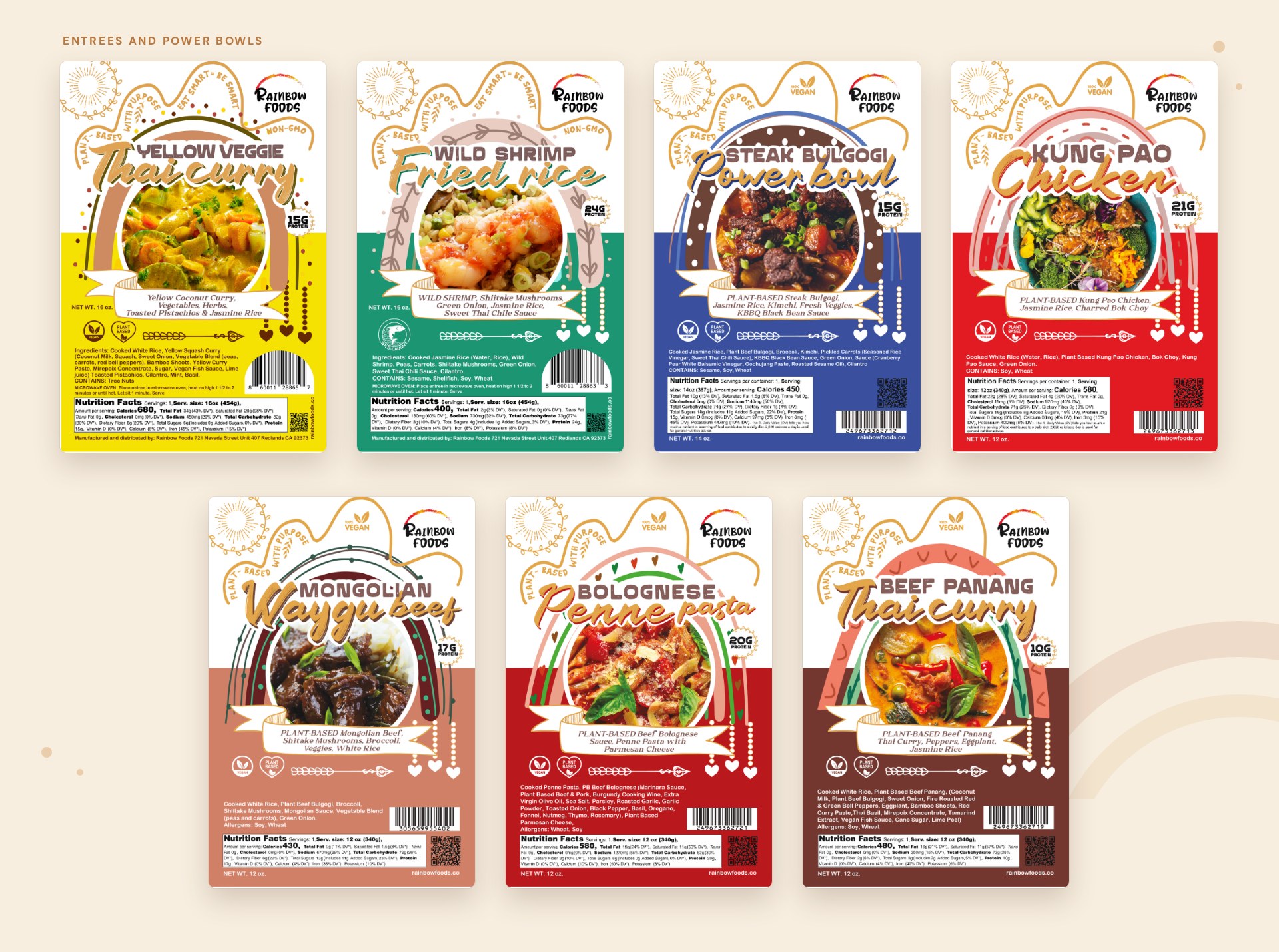
The layout rolled out across entrees, power bowls, the breakfast line and Burrititos.
- 06Staging Camp
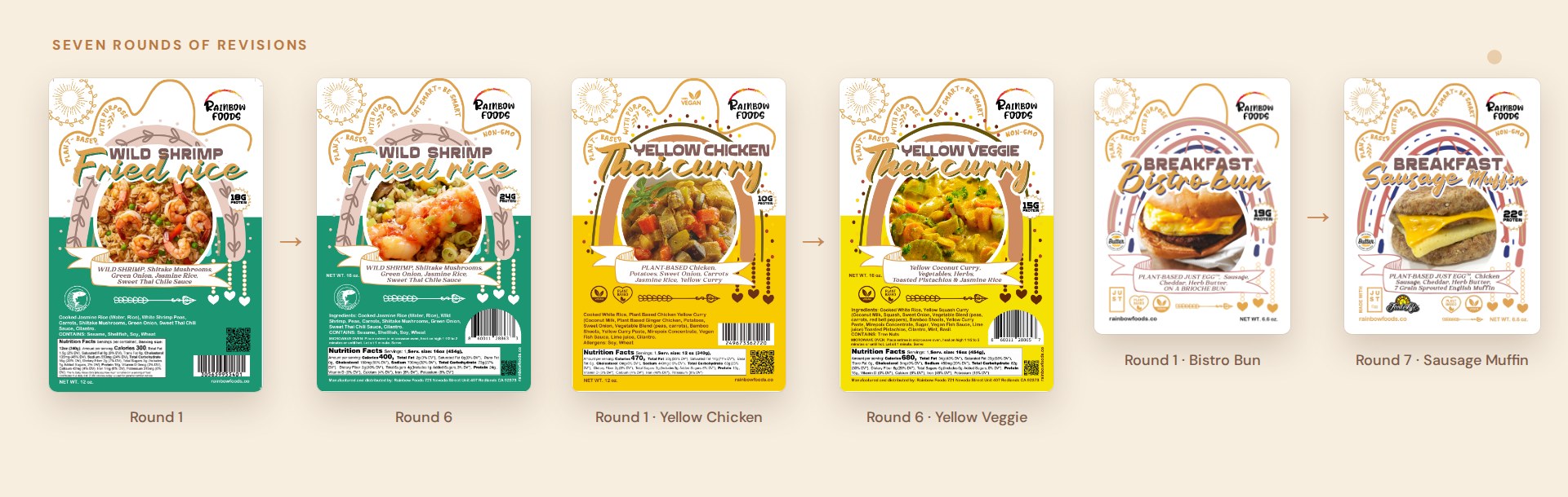
Seven rounds of revision as recipes, names, photos and barcodes changed.
- 08Go-Live Summit
Print-ready front and back labels that read as one family in the case.
Task
Rainbow Foods was adding products quickly, and each new item needed a label that met the practical requirements of food packaging and still looked like part of the same brand. The challenge was to design a system with enough personality to stand out in a refrigerated case and enough structure to absorb new flavors, recipe changes and two different label formats without being redrawn each time.
Rainbow Foods makes plant-based, ready-to-eat meals in Redlands, California. As the range grew from a few entrees into a full line of power bowls, pastas and breakfast items, the packaging needed to look like one family. We developed the brand mark and a label system around it, then rolled that system out across the range.
The look is boho and hand-drawn. Rainbow arches frame each dish, with sunbursts, vines and strings of dots and hearts around them. Script lettering sits over bold capitals for the product name, and each flavor gets its own color.
Project Overview
Brand Mark and Design Elements
The logo pairs loose hand lettering with a brushed arc that runs from red to yellow. It sits in the same corner of every label. The supporting elements are drawn in the same hand: the sunburst, the wavy border that carries the claims “Plant-based with purpose” and “Eat smart = be smart”, and the vegan and plant-based icons.
Entrees and Power Bowls
Every entree label follows one layout. The arch and the product photo sit at the top, a ribbon carries the short description, and a solid color band holds the ingredients, nutrition facts and barcode. The band color changes with the flavor, so the line is easy to tell apart on a shelf: yellow for the Thai curry, green for the fried rice, blue for the bulgogi bowl.
Breakfast Line
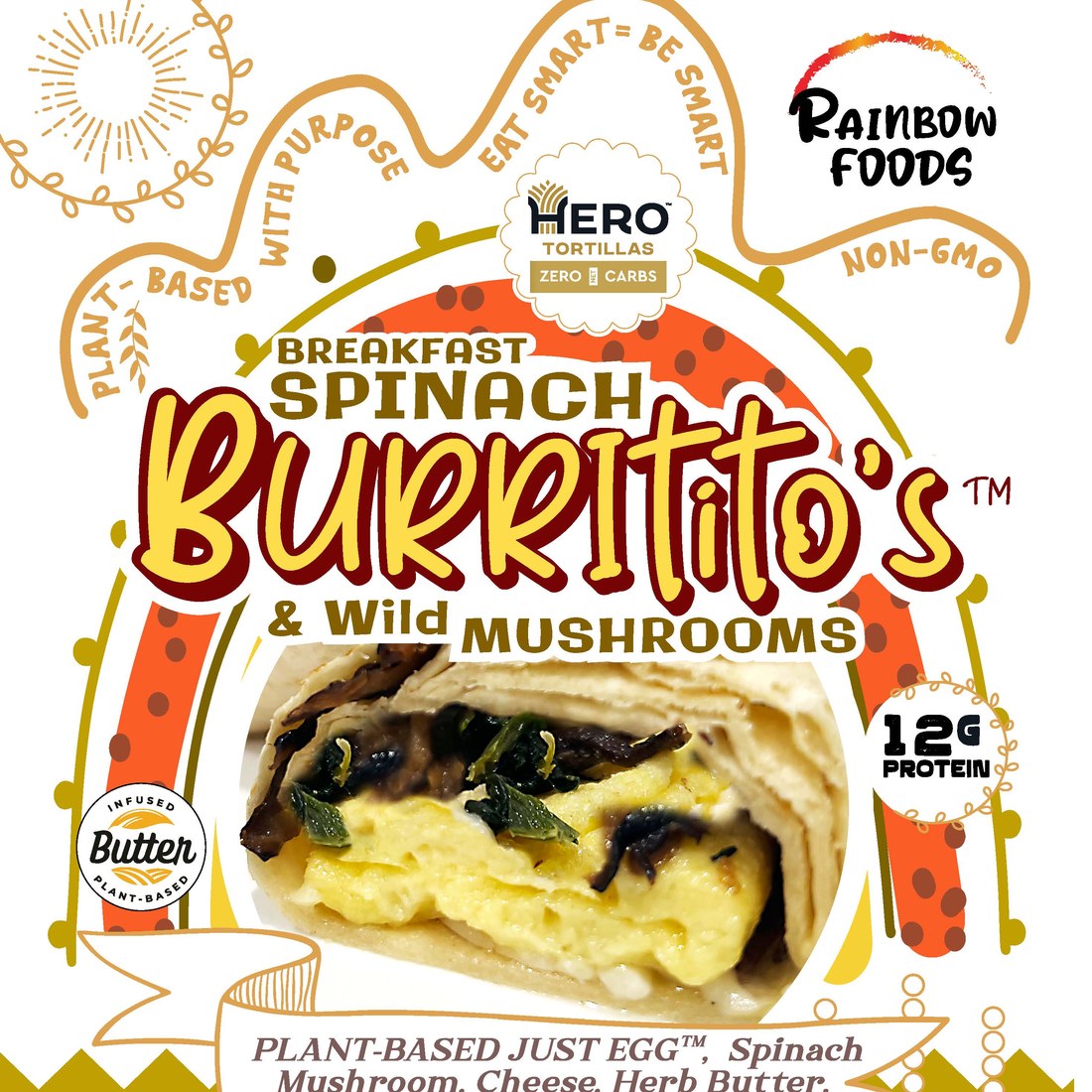
The breakfast items use a wider label and a larger photo. The Burrititos have their own chunkier wordmark, and the labels make room for the partner ingredient marks that appear on the pack.

Front and Back Panels
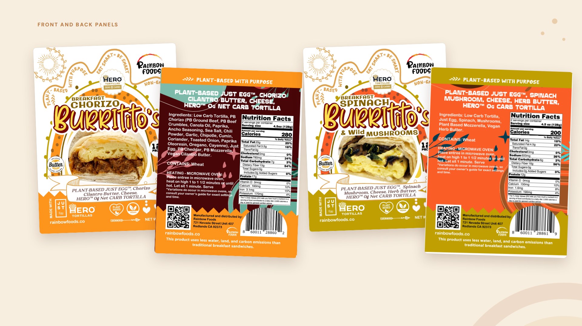
The two-part breakfast labels split the work between panels. The front sells the product. The back carries the full nutrition facts, ingredients, heating instructions, a QR code and a line about the lower water, land and carbon footprint, on a patterned panel in the product’s color.
Design Development
The labels went through seven rounds of revisions as recipes and names changed. Yellow Chicken Thai Curry became Yellow Veggie Thai Curry, the Bistro Bun became the Sausage Muffin, and photos, protein counts and barcodes were updated along the way. Because every label is built from the same parts, each change was a quick edit and the line stayed consistent. Final files were delivered print-ready with trims.