


Keto Kitchen
Sub-brand, Packaging and Campaign
Developed and designed by Creartful Digital Experiences, Keto Kitchen represents Cedarlane’s bold step into the low-carb, high-flavor meal category, offering consumers balanced, ready-to-enjoy meals that align with modern keto lifestyles. The creative direction focused on merging farm-to-fork authenticity with a clean, high-protein visual identity.
Creartful led the project from strategy through final packaging, creating a distinct sub-brand system within Cedarlane’s portfolio. The design incorporates earthy color palettes, ingredient-forward photography, and bold typography that highlight nutritional clarity while communicating wholesome freshness.
The result is a cohesive brand family that positions Cedarlane as a trusted leader in the better-for-you convenience space, blending culinary comfort with disciplined nutrition.
The route
How this project climbed.
- 02Blueprint Base Camp
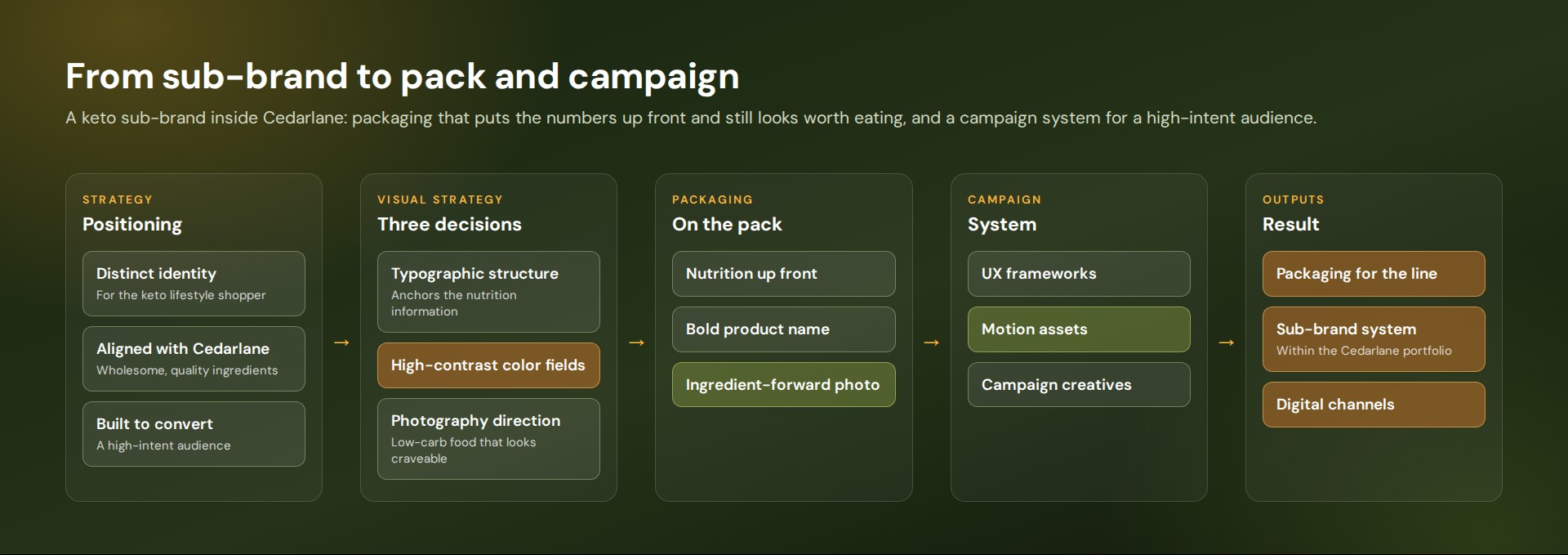
A keto sub-brand inside Cedarlane, for a shopper who scans the nutrition numbers first.
- 03Moodboard Meadow
High-contrast color fields and photography that makes low-carb food look worth eating.
- 04Wireframe Switchbacks
A typographic structure that puts the nutrition information up front.
- 05Commit Ridge
Packaging for the line, plus UX frameworks, motion assets and campaign creative.
- 08Go-Live Summit
A sub-brand system on pack and across digital channels.
Task
Launching a keto sub-brand inside an established food company takes a careful balance: the new identity must feel distinct and energized enough to attract the keto lifestyle consumer, while staying clearly aligned with Cedarlane’s broader promise of wholesome, quality ingredients. Consumers shopping the keto category scan for specific nutritional signals, but they also want a product that looks and feels premium.
Project Overview
Packaging
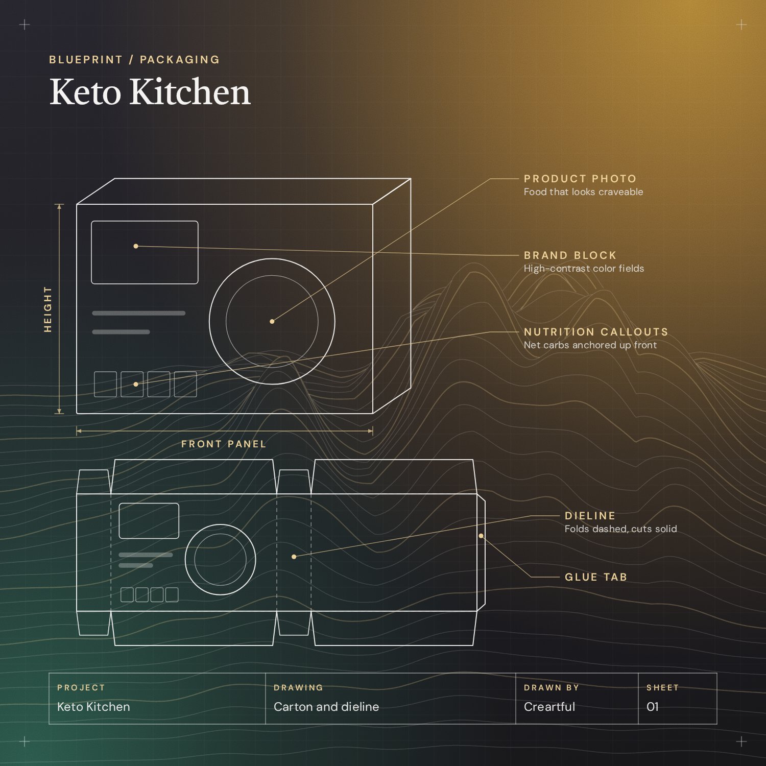
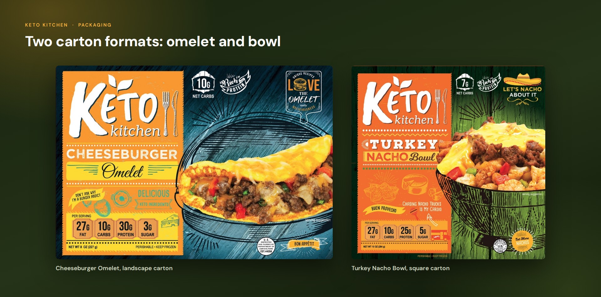
The Keto Kitchen packaging had to communicate indulgence and restraint at the same time. Bold typographic structure anchors the key nutritional claims, high-contrast color fields project confidence and appetite appeal, and a clear information hierarchy guides the eye through a complex label. The photography direction makes low-carb food look craveable, shifting the keto narrative from sacrifice to lifestyle.
The layout adapts to more than one carton format, including a landscape carton for the omelets and a square carton for the bowls. The dielines below show the full wrap for seven of the meals.


Campaign
We built the Keto Kitchen campaign system with conversion in mind, developing a Figma-based UI/UX framework, a motion identity system and a suite of campaign assets that speak directly to a high-intent, health-motivated audience across digital channels. Conversion-focused design patterns and appetite-forward photography direction carry the look of the packaging into every asset.