

Blessed Pressed Juicery

Cold Pressed Brand Direction
Blessed Pressed was developed as a packaging-first brand system for cold pressed juices and adjacent prepared-food extensions, bringing bold juicery energy, PDP bottle presentation, and flavor-led merchandising into one cohesive visual direction. The project centered on making every label feel loud, shelf-aware, and digitally persuasive, with each SKU carrying enough personality to perform both as physical packaging and as ecommerce-ready product imagery.
Working across bottle mockups, flattened label systems, and prepared-food package concepts, the direction balanced nutrition-panel clarity, ingredient storytelling, and expressive flavor naming with a more commercial product hierarchy. Adobe Illustrator drove the vector label architecture and dieline thinking, Photoshop handled compositing and PDP mockup refinement, InDesign supported presentation layout and review boards, while the wider Adobe Creative Suite workflow kept typography, texture, color, and export consistency tight across every deliverable.
PDP Bottle Packaging
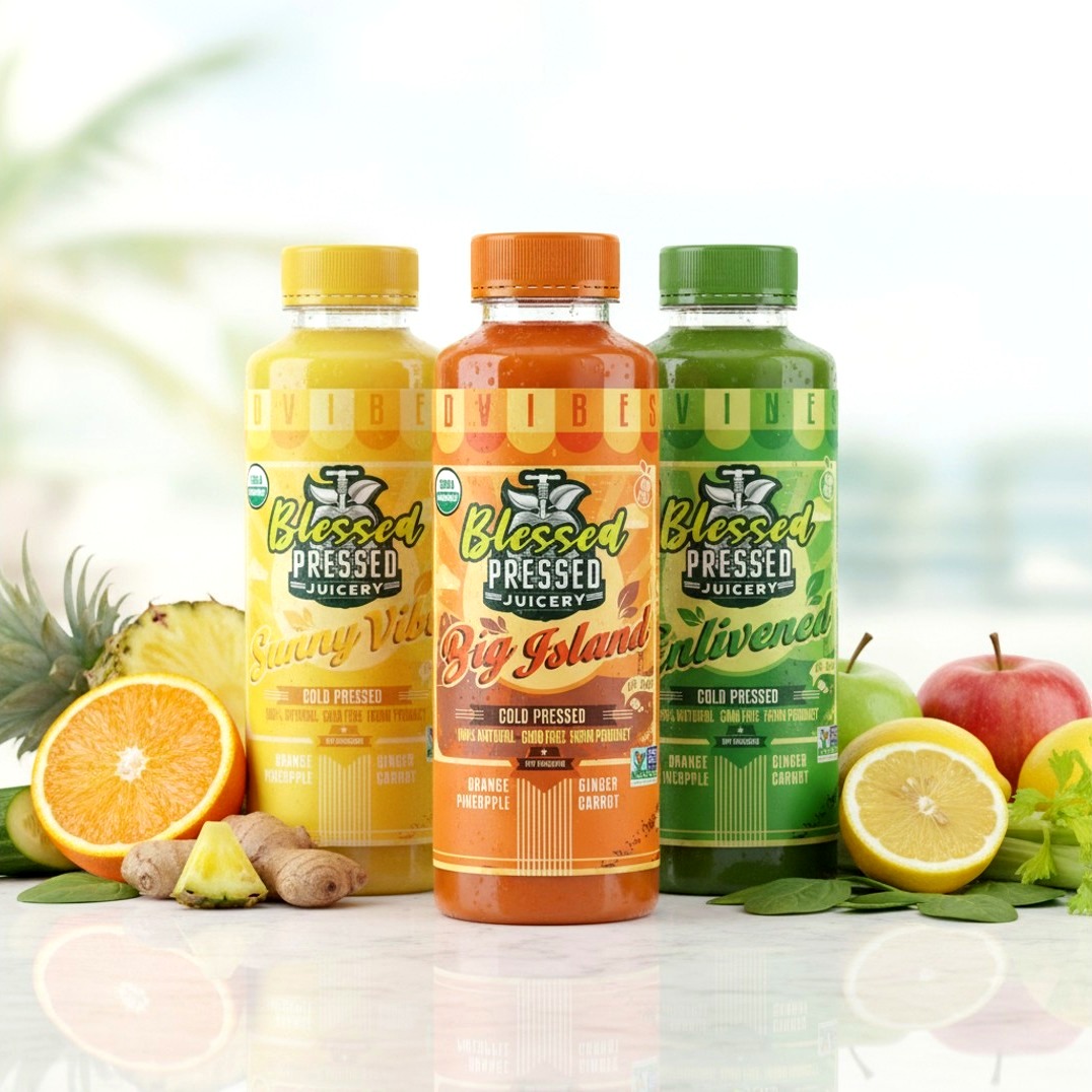
The bottle system was built around strong flavor cues and immediately readable front-of-pack storytelling. Variants like Big Island, Sunny Vibes, and Enlivened use saturated citrus and greens-based palettes, oversized script naming, and ingredient-led combinations such as orange, pineapple, ginger, carrot, apple, cucumber, celery, spinach, orange, and lemon to make the cold pressed range feel alive on both a shelf and a PDP grid.
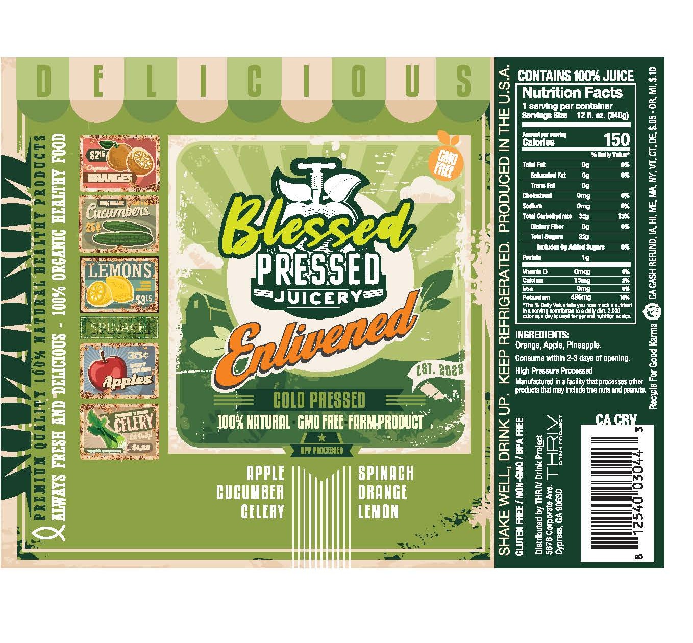
We treated the label architecture as more than decoration. Nutrition facts, organic claims, non-GMO cues, HPP processing language, and bottle-side ingredient panels were integrated as part of the brand voice, giving the packaging enough regulatory realism and product credibility to read like a launch-ready consumer line rather than concept-only artwork.
Brand Extension Packaging
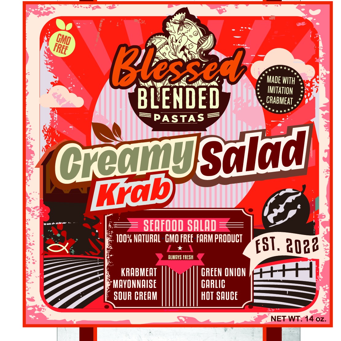
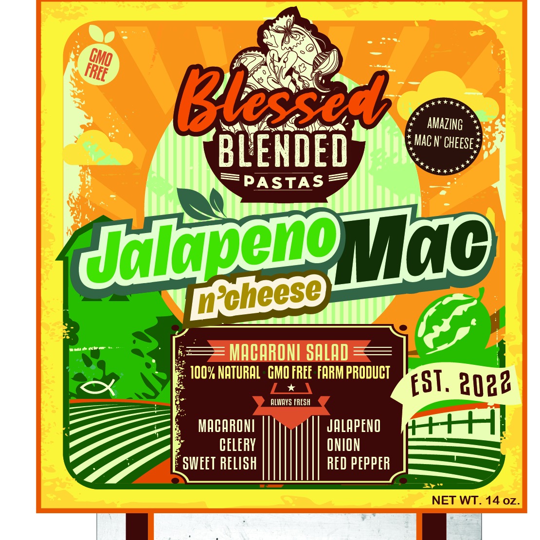
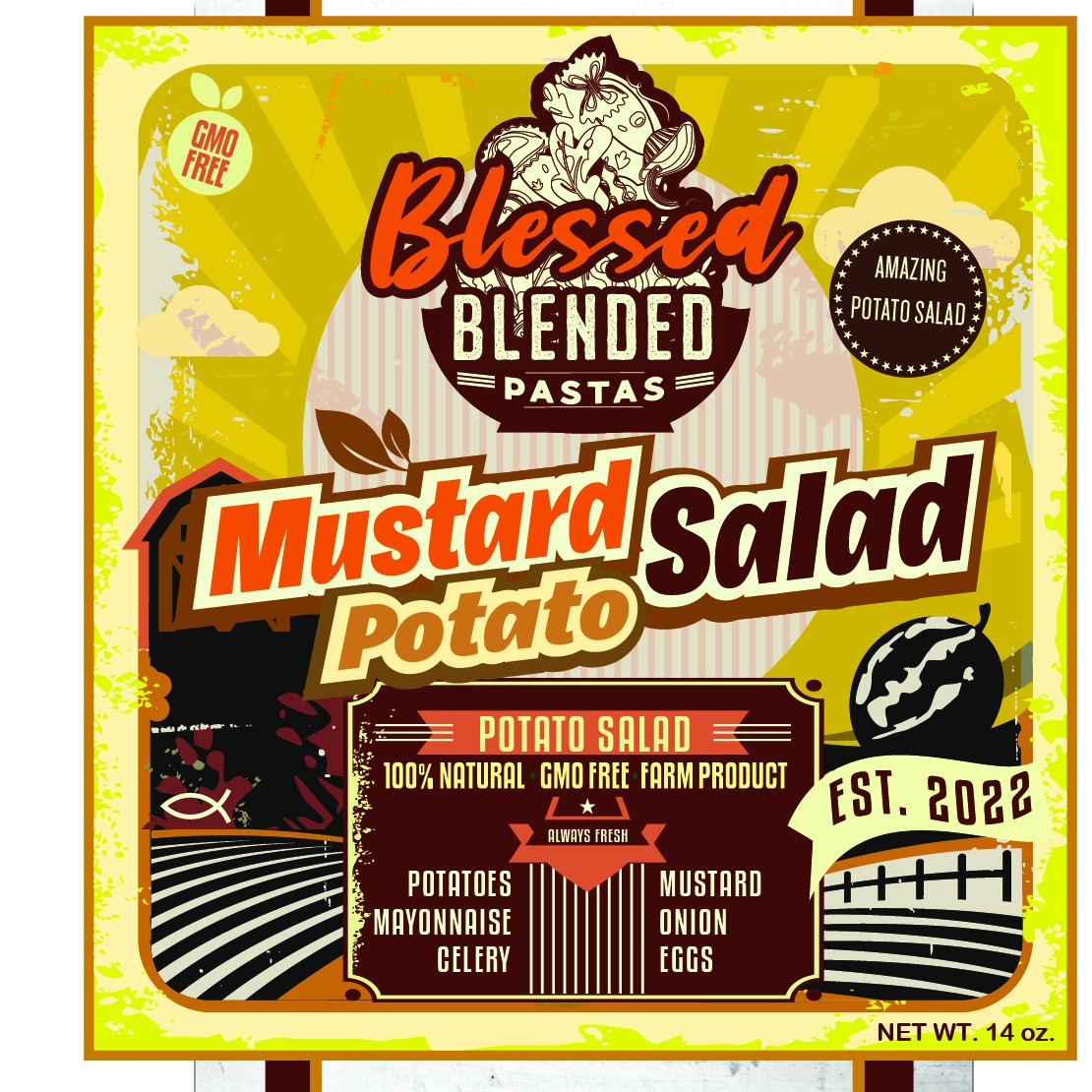
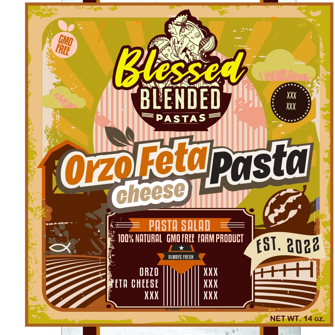
The Blessed visual language was also extended into a secondary packaged-food direction under Blessed Blended Pastas, exploring how the same loud, flavor-forward identity could stretch into deli-style and prepared-food concepts. Creamy Salad Krab, Jalapeno Mac n’ Cheese, Mustard Potato Salad, and Orzo Feta Pasta all carry the same bold naming structure, badge language, color blocking, and hand-built texture so the line feels connected even as the products shift category.
That extension work shows the strength of the underlying system: the typography stack, emblem treatment, callout badges, and ingredient storytelling are flexible enough to move from bottled juice to boxed and packaged food without diluting the core brand personality. It turns Blessed Pressed into a broader packaging platform, not just a single-bottle exercise.
Outcome
The final case study positions Blessed Pressed as a sharper, more marketable brand platform built for packaging realism and digital merchandising. Every asset is tuned to perform across shelf presentation, product-detail-page imagery, internal review decks, and future line extensions, giving the brand a stronger visual foundation for growth.
The route
How this project climbed.
- 02Blueprint Base Camp
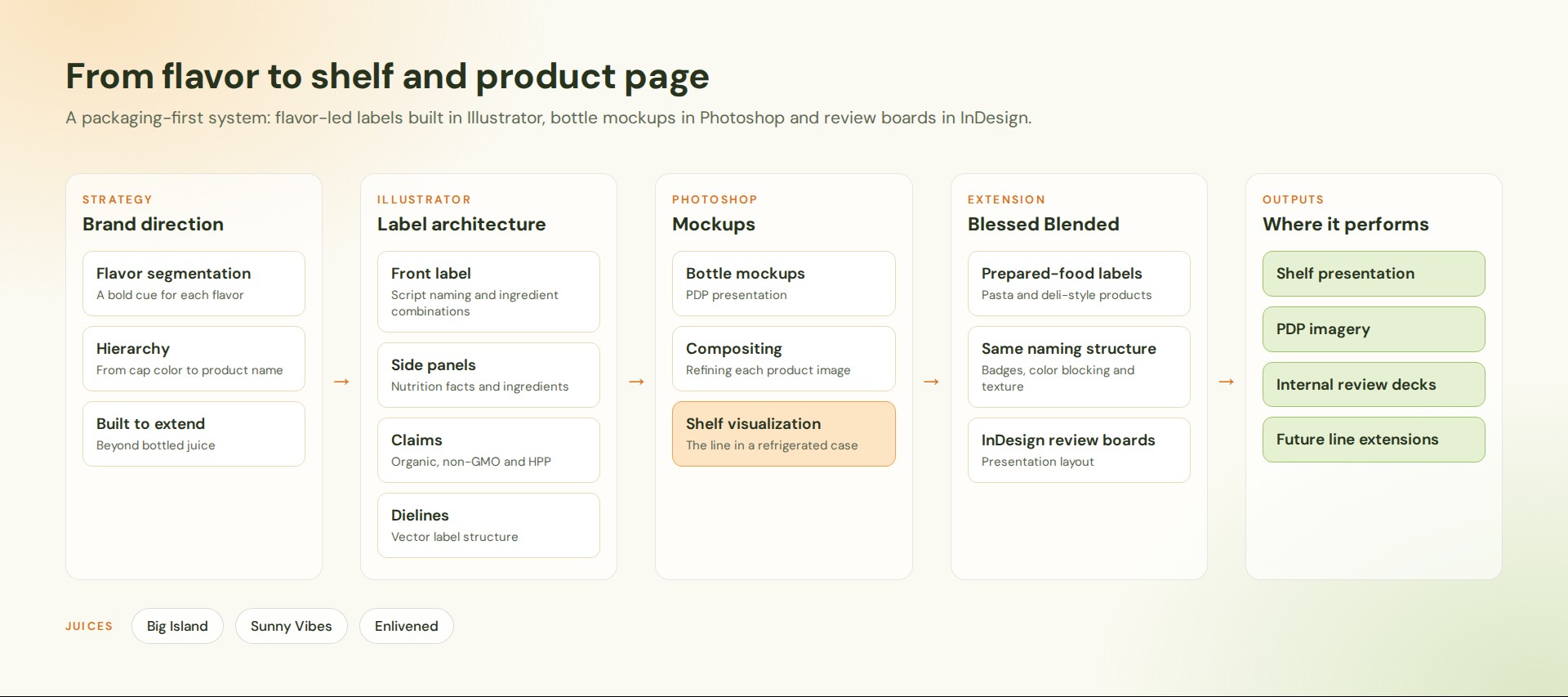
Flavor segmentation and a hierarchy that runs from cap color to product name.
- 03Moodboard Meadow
Script naming, ingredient combinations and a bold cue for each flavor.
- 04Wireframe Switchbacks
Label architecture in Illustrator: front label, side panels, claims and dielines.
- 05Commit Ridge
Bottle mockups and composites in Photoshop for product pages and shelf views.
- 08Go-Live Summit
Shelf presentation, PDP imagery and review decks, extended to the Blessed Blended line.
Task
Blessed Pressed needed more than attractive bottle renders. The challenge was to build a packaging system that could carry the energy of a cold pressed juicery brand across front-label storytelling, side-panel nutrition communication, ingredient-led flavor naming, and ecommerce-ready PDP imagery without losing clarity or commercial credibility. At the same time, the visual system had to prove it could stretch beyond bottled juice into adjacent packaged-food concepts such as pasta salad and deli-style prepared products. Our approach centered on bold flavor segmentation, stronger hierarchy from cap color to product name, and a presentation framework that made every SKU feel shelf-ready, thumbnail-ready, and expansion-ready.
Blessed Pressed was developed as a packaging-first brand system for cold pressed juices and adjacent prepared-food extensions, bringing bold juicery energy, PDP bottle presentation, and flavor-led merchandising into one cohesive visual direction. The project centered on making every label feel loud, shelf-aware, and digitally persuasive, with each SKU carrying enough personality to perform both as physical packaging and as ecommerce-ready product imagery.
Working across bottle mockups, flattened label systems, and prepared-food package concepts, the direction balanced nutrition-panel clarity, ingredient storytelling, and expressive flavor naming with a more commercial product hierarchy. Adobe Illustrator drove the vector label architecture and dieline thinking, Photoshop handled compositing and PDP mockup refinement, InDesign supported presentation layout and review boards, while the wider Adobe Creative Suite workflow kept typography, texture, color, and export consistency tight across every deliverable.
Project Overview
Juicery Product Family
The bottle lineup is now brighter and more immediate, giving the product family better presence on the page while still keeping the edge-to-edge crop. That helps the juices read more clearly and gives the hero image more visual lift without reintroducing any padded framing treatment.
Flat Label System
The Enlivened label is shown as a full-bleed rectangular graphic with the artwork running directly to the image edges. This keeps the focus completely on the label system itself and presents the packaging in a cleaner, more direct way.
Prepared Food Label Concepts
The prepared-food labels have been recropped again so the design content sits more evenly in each image instead of leaning right. That keeps the typography, naming, and ingredient callouts visually centered within the image area and makes the full line feel more intentional as a set.
Retail Shelf Visualization
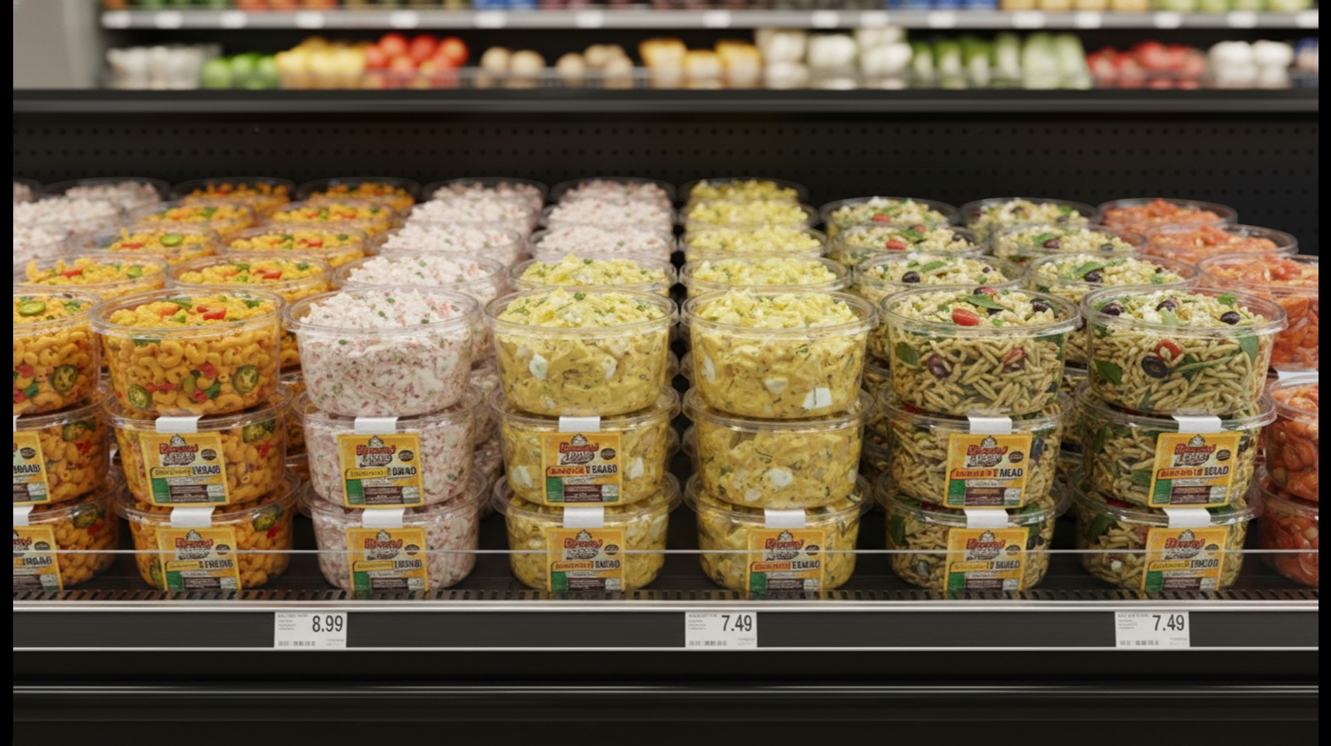
To push the packaging system closer to a real grocery context, we also added a refrigerated shelf visualization for the Blessed Blended line. The goal was to show how the prepared-food extension could read in a fresh produce or deli environment while still feeling consistent with the broader brand system.