
OpenCoconut


Packaging-Led Brand System
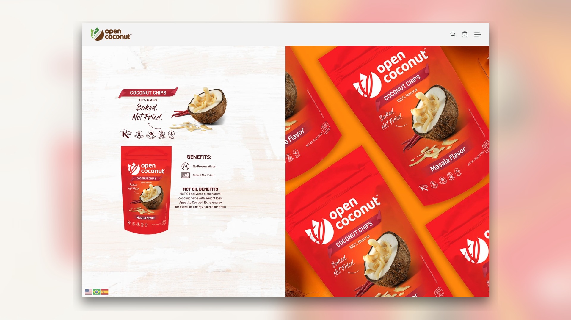
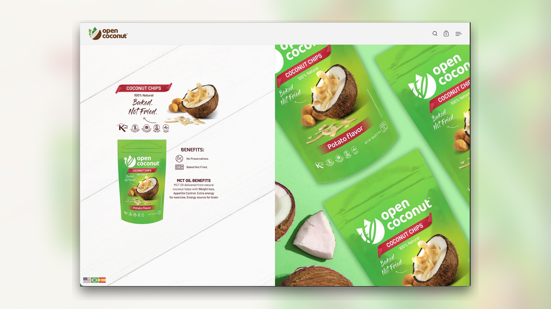
For OpenCoconut, we developed a brand presentation system that brought packaging design, project imagery, and the website build into one cohesive digital experience. The work focused on translating a colorful coconut-based product range into a stronger ecommerce-ready visual language, balancing shelf impact, brand clarity, and web-first merchandising so every SKU felt consistent from packaging mockup to on-site presentation.
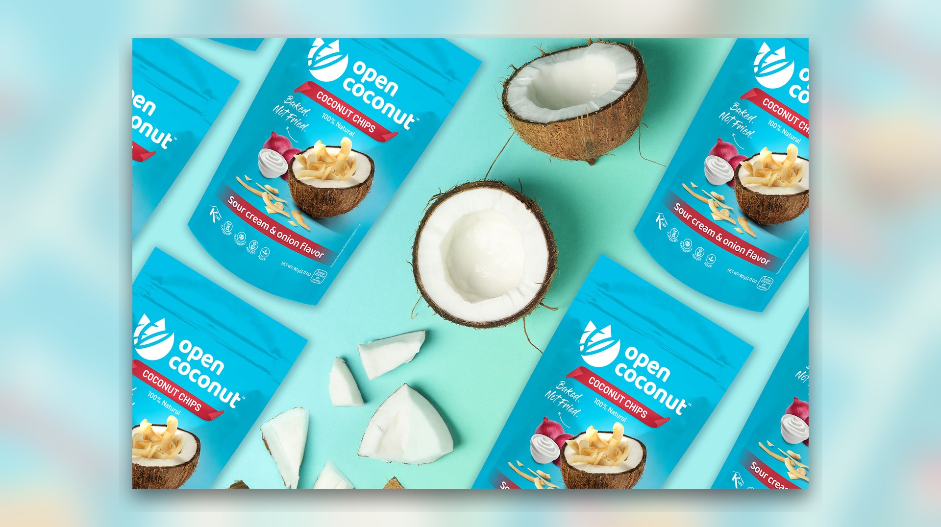
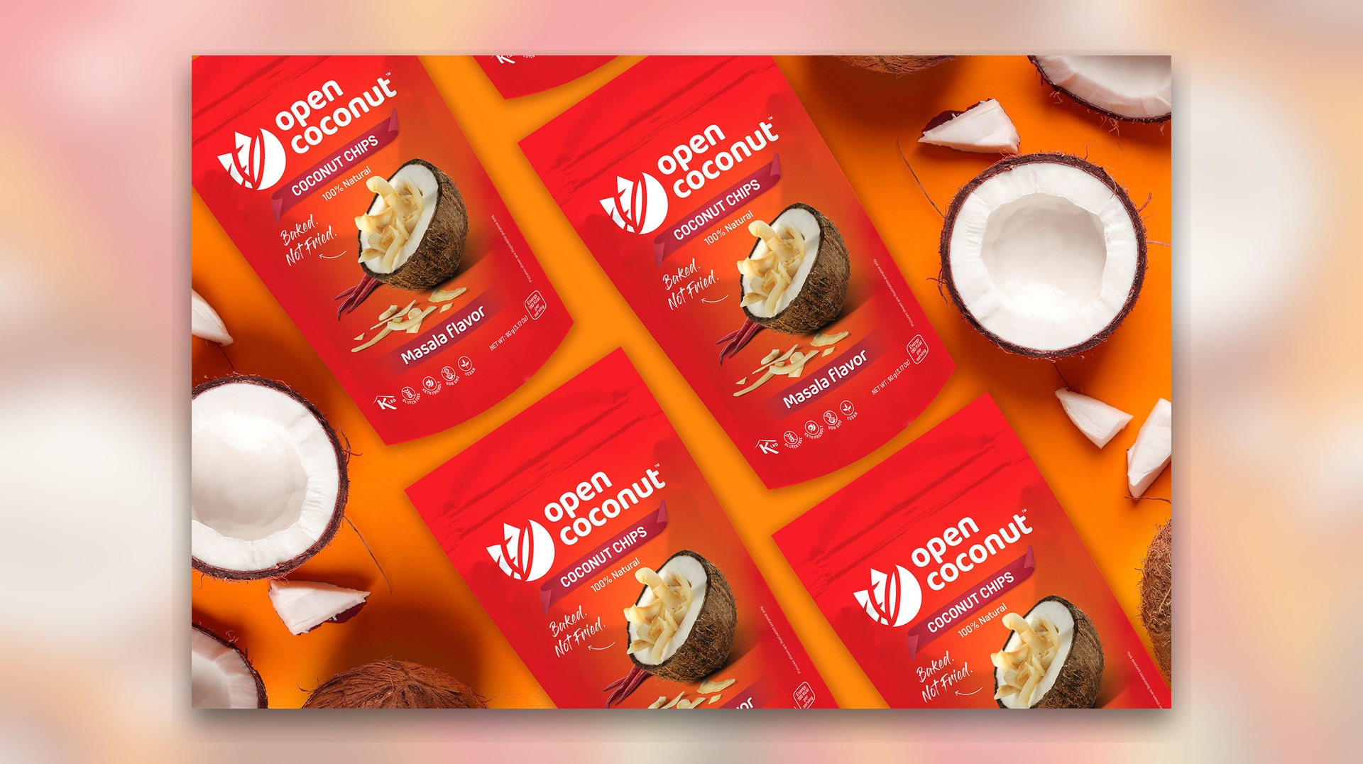
Across the packaging direction, we pushed for bolder flavor segmentation, clearer product hierarchy, and cleaner benefit communication. That meant pairing bright category-led color stories with ingredient-driven visuals, baked-not-fried positioning, and a presentation style that kept the product line feeling natural, premium, and easy to understand across both retail-facing and digital-facing assets.
Website Build
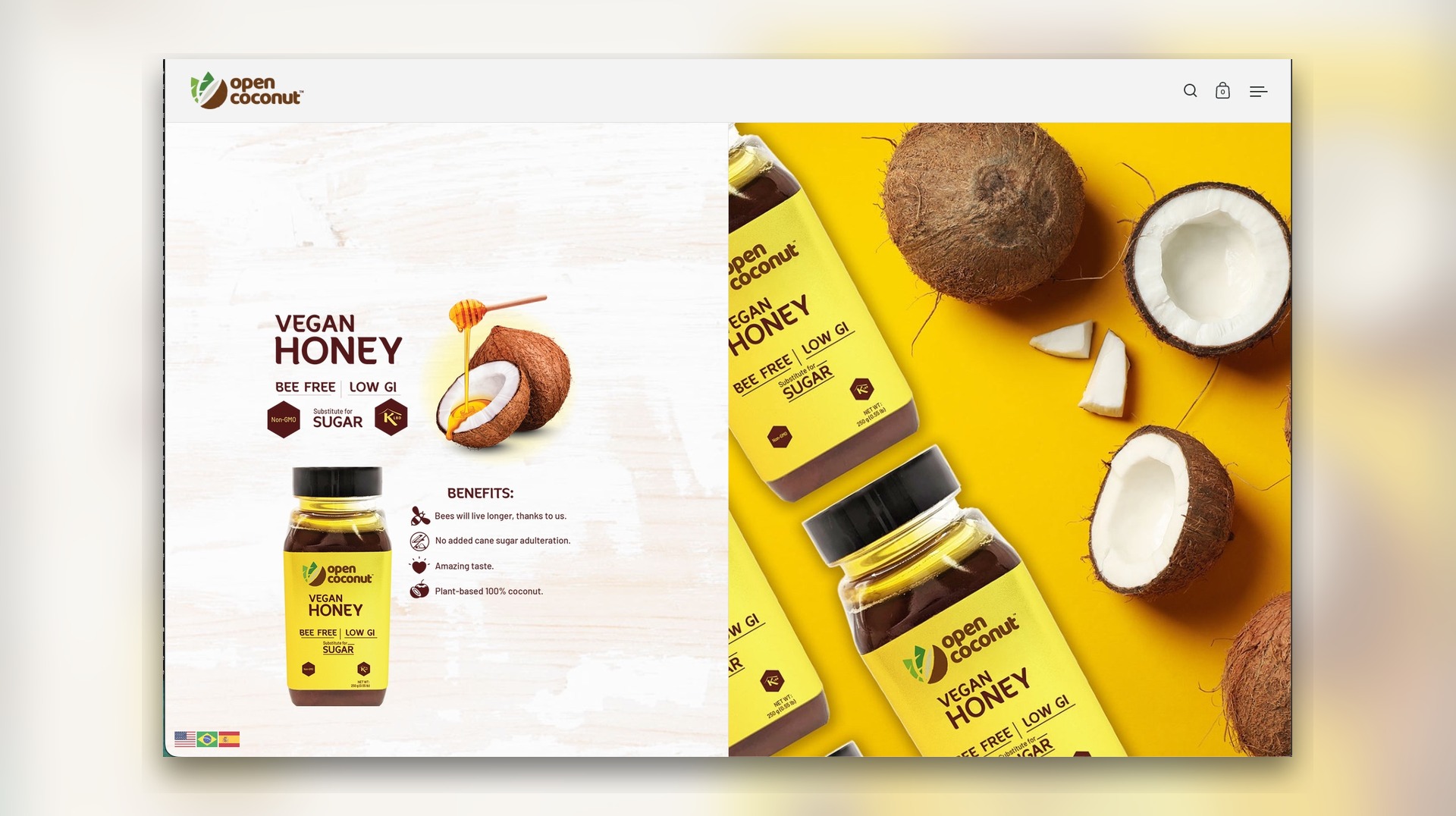
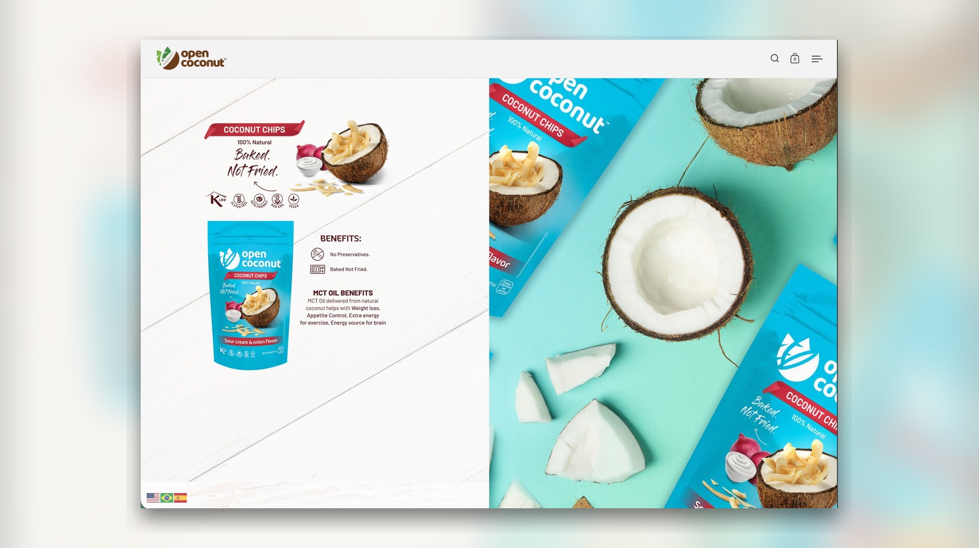
The website build translated the packaging language into a polished brand presentation capable of showcasing both the coconut chips line and the vegan honey extension inside one connected visual system. Product visuals, benefit summaries, ingredient cues, and campaign-style compositions were arranged to give the site a more editorial, launch-ready feel while still supporting practical ecommerce browsing and product storytelling.
Rather than treating the website as a separate deliverable, we used it as an extension of the packaging system. Mockups, flavor pages, and hero imagery were all designed to feel like part of one coordinated rollout, strengthening the overall case study as both a digital storefront concept and a launch-ready brand presentation.
Project Imagery
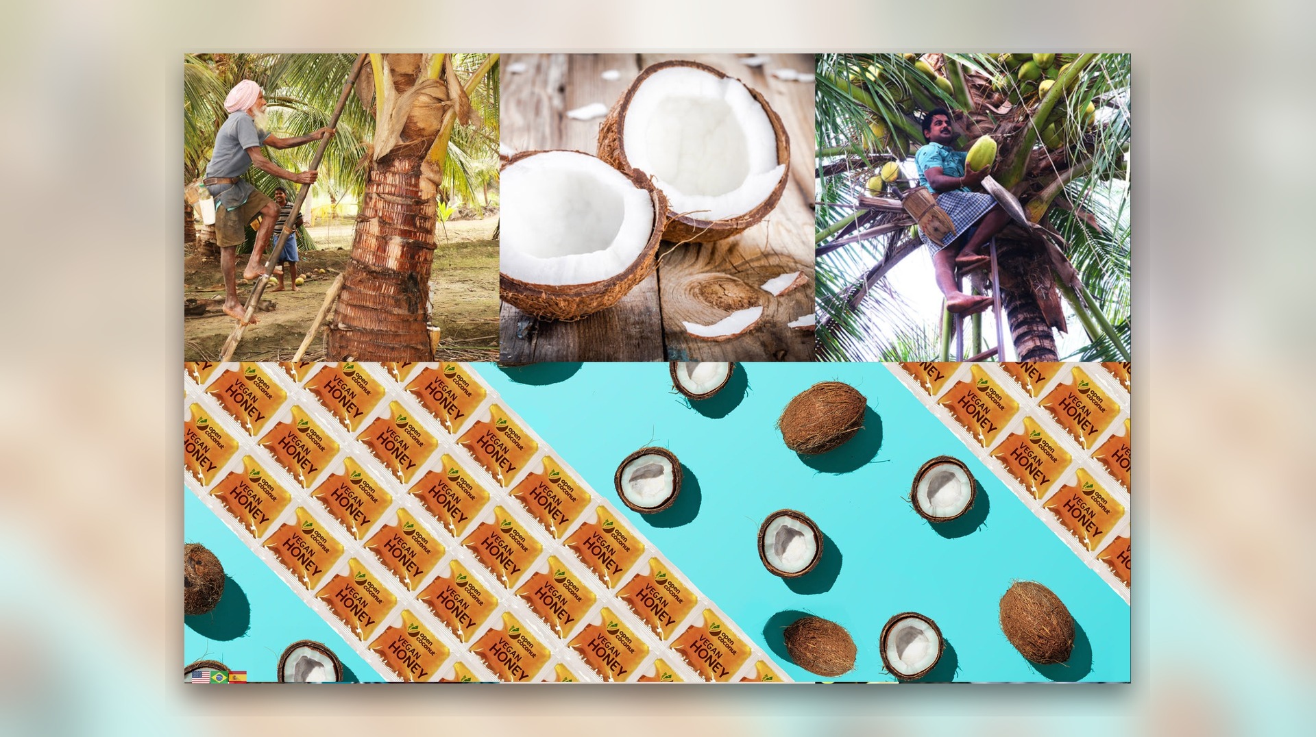
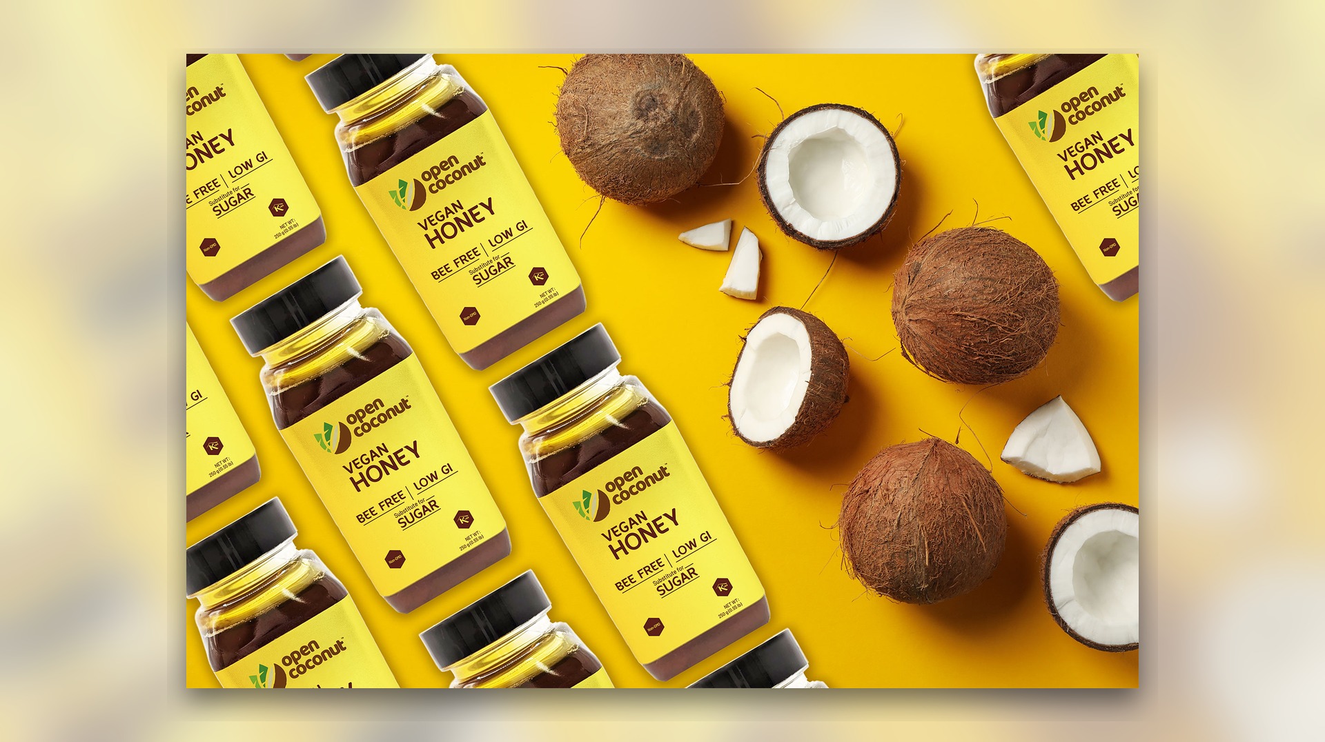
To support launch and portfolio presentation, we created a media set of flat lays and composited project visuals that made the range feel more premium and campaign-ready. These assets gave OpenCoconut enough visual flexibility to present packaging, sourcing, and website concepts together while maintaining a consistent brand signal across every image.
Outcome
The final direction positions OpenCoconut as a sharper, more market-ready consumer brand. Packaging, imagery, and website design now read as one unified merchandising system, giving the product line stronger visual consistency, clearer storytelling, and a more credible presence across both shelf-facing and digital environments.
The route
How this project climbed.
- 02Blueprint Base Camp
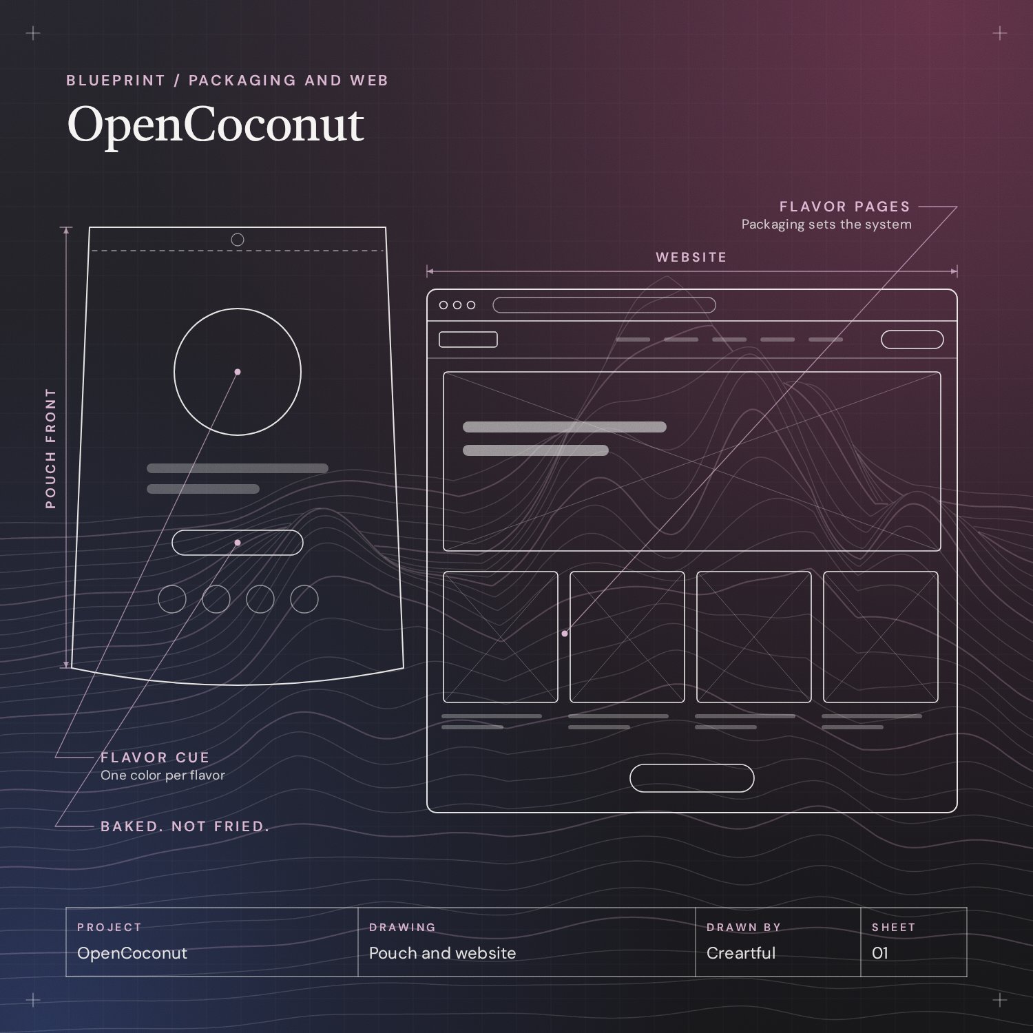
Flavor segmentation, product hierarchy and one benefit line: Baked. Not Fried.
- 03Moodboard Meadow
A saturated color per flavor, with ingredient cues.
- 04Wireframe Switchbacks
The website planned from the packaging: flavor pages, benefit summaries and hero imagery.
- 05Commit Ridge
Coconut chips in four flavors, a vegan honey line extension and the site build.
- 08Go-Live Summit
Retail packaging, a digital storefront concept and launch visuals, delivered as one rollout.
Task
OpenCoconut required more than isolated packaging mockups or standalone web screens. The challenge was to build a coherent brand presentation system for a growing coconut-based product line, ensuring masala, sour cream and onion, potato, caramel, and vegan honey extensions could all live under one visual language without losing shelf impact or product clarity. From a strategy standpoint, the work needed to bridge retail packaging, campaign imagery, and ecommerce presentation so the brand felt commercially credible in both physical and digital contexts. Our approach focused on tighter flavor segmentation, stronger product hierarchy, and a website direction that treated packaging as the foundation of the entire customer-facing experience.
For OpenCoconut, we developed a brand presentation system that brought packaging design, project imagery, and the website build into one cohesive digital experience. The work focused on translating a colorful coconut-based product range into a stronger ecommerce-ready visual language, balancing shelf impact, brand clarity, and web-first merchandising so every SKU felt consistent from packaging mockup to on-site presentation.
Across the packaging direction, we pushed for bolder flavor segmentation, clearer product hierarchy, and cleaner benefit communication. That meant pairing bright category-led color stories with ingredient-driven visuals, “Baked. Not Fried.” positioning, and a presentation style that kept the product line feeling natural, premium, and easy to understand across both retail-facing and digital-facing assets.
Project Overview

Packaging Direction
The packaging work established a unified family across masala, sour cream and onion, potato, caramel, and vegan honey extensions while preserving strong individual SKU identity. Each concept was designed to feel immediately recognizable on a grid, on a product shelf, and inside the website build, with saturated palette choices and ingredient cues helping the range read fast without losing personality.
We also refined how benefits were expressed visually: low GI, bee-free vegan honey positioning, preservative-free claims, and coconut-led sourcing cues were all integrated into the compositions so the product story could live inside both the packaging and the site experience without needing separate campaigns to explain the brand.
Website Build
The website build translated the packaging language into a polished brand presentation that could showcase both the core coconut chips line and the vegan honey extension. Product visuals, benefit summaries, and supporting ingredient imagery were arranged to give the site a more editorial, campaign-ready feel while still supporting practical ecommerce browsing and product storytelling.
Instead of treating the website as a separate deliverable, we used it as an extension of the packaging system. Mockups, flavor pages, and hero imagery were all designed to feel like part of one connected brand rollout, which made the final project stronger as both a digital storefront concept and a launch-ready visual case study.
Project Imagery
To support launch and portfolio presentation, we created a media set of flat lays and composited project visuals that made the range feel more premium and campaign-ready. These assets gave OpenCoconut enough visual flexibility to present packaging, sourcing, and website concepts together while maintaining a consistent brand signal across every image.