

Simply Plant Powered
Brand, Packaging and Digital System
Developed and designed by Creartful Digital Experiences, Simply Plant Powered is Cedarlane Foods’ modern evolution into the clean-label, plant-based space. The brand embodies a fresh, energetic, and nutrient-forward lifestyle, built for today’s health-conscious consumer who wants convenience without compromise.
Creartful led the initiative from concept through completion, developing the visual identity, tone, and packaging system for the entire product line. Each package features vibrant color palettes, natural textures, and bold ingredient photography that communicate transparency, freshness, and flavor.
The result is a cohesive, shelf-ready brand that bridges culinary craft and sustainable nutrition, positioning Cedarlane as a forward-thinking leader in the plant-powered food movement.
The route
How this project climbed.
- 02Blueprint Base Camp
Cedarlane brand equity, a crowded plant-based shelf and a new shopper who wants convenience.
- 03Moodboard Meadow
Art direction set first: the color system, the illustration style and the type voice.
- 04Wireframe Switchbacks
A packaging system for the whole line, with vibrant palettes, natural textures and ingredient photography.
- 05Commit Ridge
Shelf-ready cartons for every product, then a Figma design system for digital.
- 08Go-Live Summit
One system on shelf, web, social and e-commerce.
Task
Cedarlane’s Simply Plant Powered line needed a packaging identity that could hold its own in an increasingly saturated plant-based retail category, without abandoning the brand equity Cedarlane had spent decades building. The challenge was to develop a visual language energetic enough to attract a new health-conscious consumer while keeping the warmth and trust signals existing Cedarlane customers expected, and then to carry that identity from the shelf to the screen.
Project Overview

Packaging
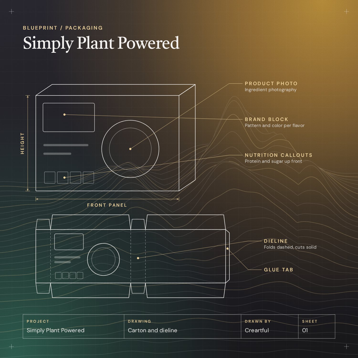
We led end-to-end packaging design for Simply Plant Powered, building a visual system rooted in chromatic contrast, botanical illustration and shelf-impact hierarchy. The art direction came first: a color system, illustration style and typographic voice were defined before a single label was designed, so every SKU reads as part of one deliberate, scalable system.
Each label communicates clean ingredients and vibrant energy, with die-cut formats, print-optimized color profiles and a structured information architecture for standout at retail.

Digital Brand System
Translating a physical packaging identity into a digital brand system takes more than lifting colors from a label. It needs a UX strategy that considers how a consumer discovers, evaluates and connects with a brand online. We built a design system in Figma with component libraries, typographic scales, responsive grids and interaction patterns that keep the brand consistent across web, social and e-commerce.
The aim was for the brand to feel as vibrant and trustworthy on a screen as it does on a supermarket shelf.