
O2 Wellness

Brand Discovery and Product Labels
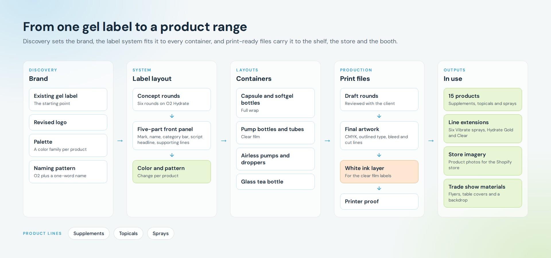
O2 Wellness is a wellness center in San Clemente, California with its own line of supplements, skin care and sprays. The project began with a single gel label and grew into a brand system for the whole range: a revised logo, a shared label layout and print-ready artwork for every container.
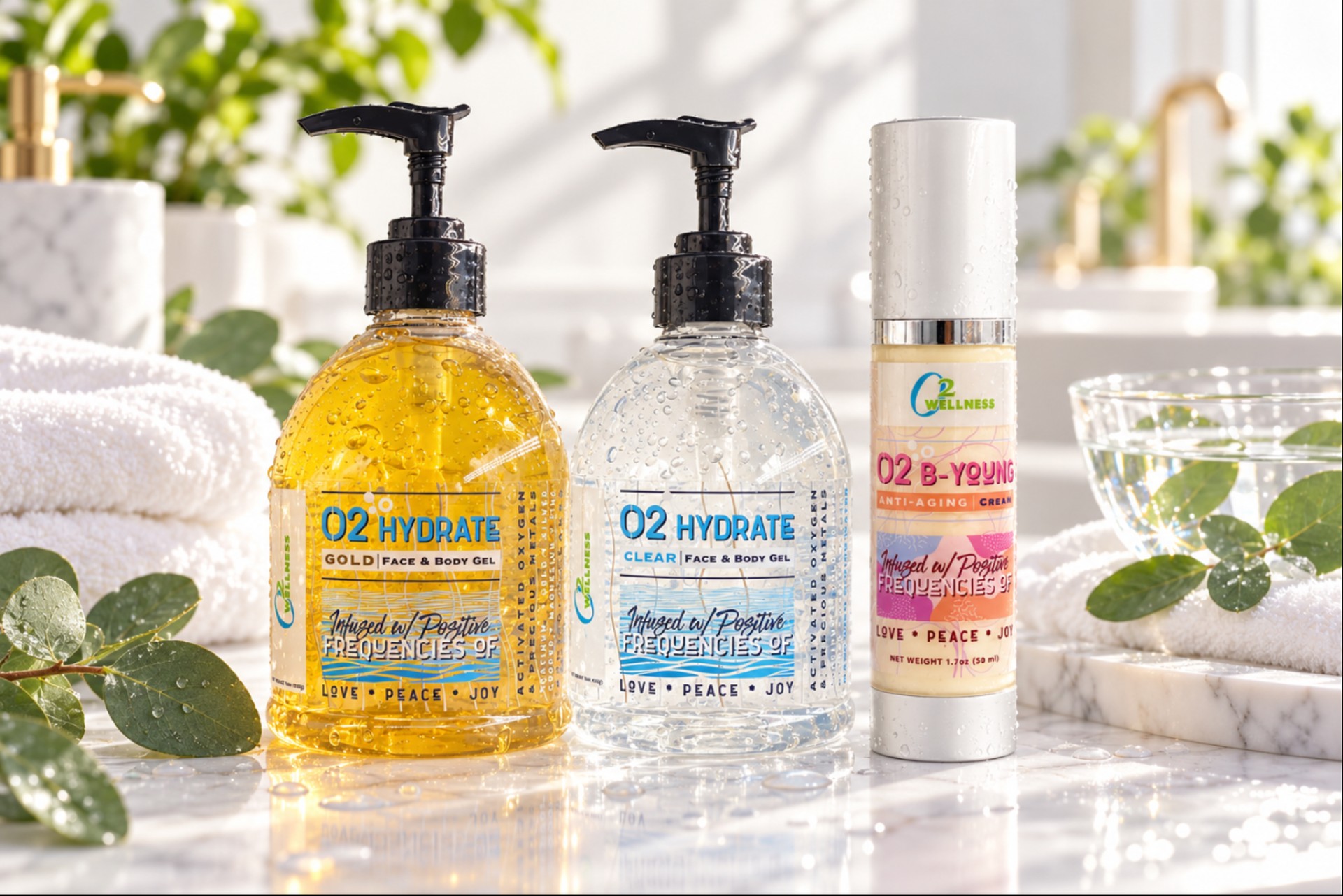
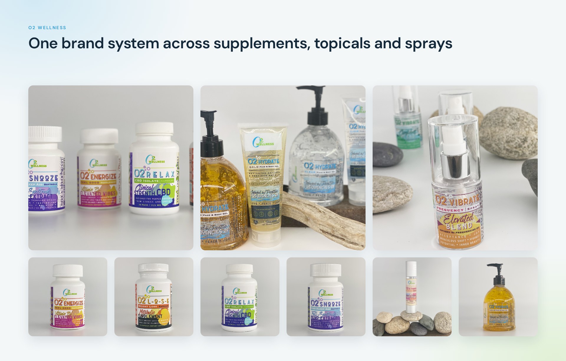
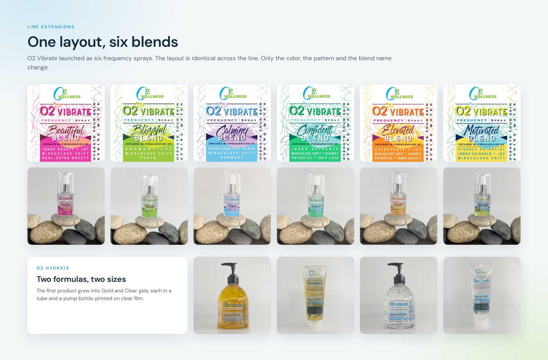
Over the course of the work the line expanded to 15 products, including the six-blend O2 Vibrate spray range and O2 Hydrate in two formulas and two sizes. The same system then carried into the online store and trade show materials.
The route
How this project climbed.
- 01Origin Point
One existing gel label was the starting point.
- 02Blueprint Base Camp
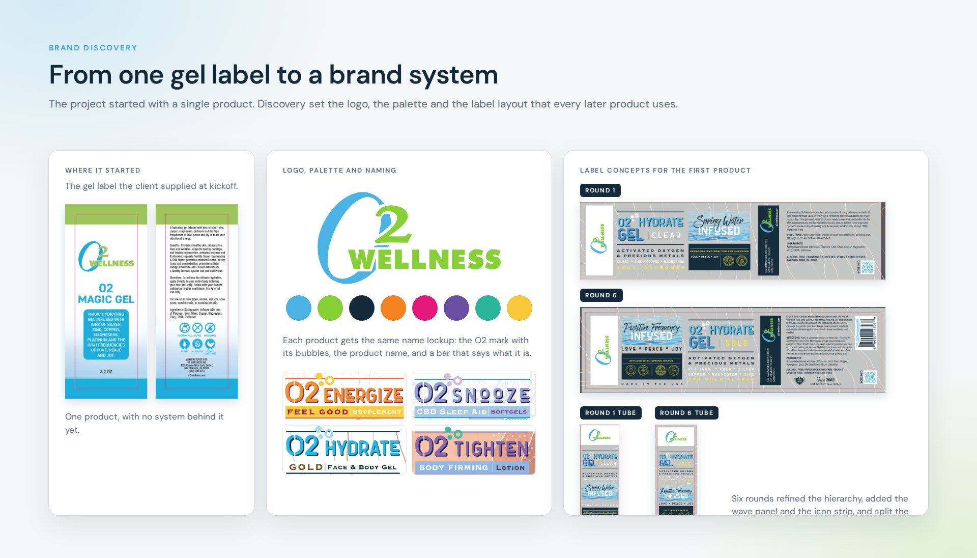
Brand discovery: a revised logo, a color family per product and a naming pattern of O2 plus one word.
- 03Moodboard Meadow
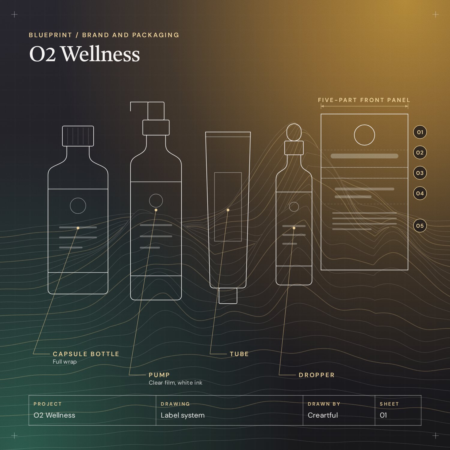
Six concept rounds on O2 Hydrate set the five-part front panel.
- 04Wireframe Switchbacks
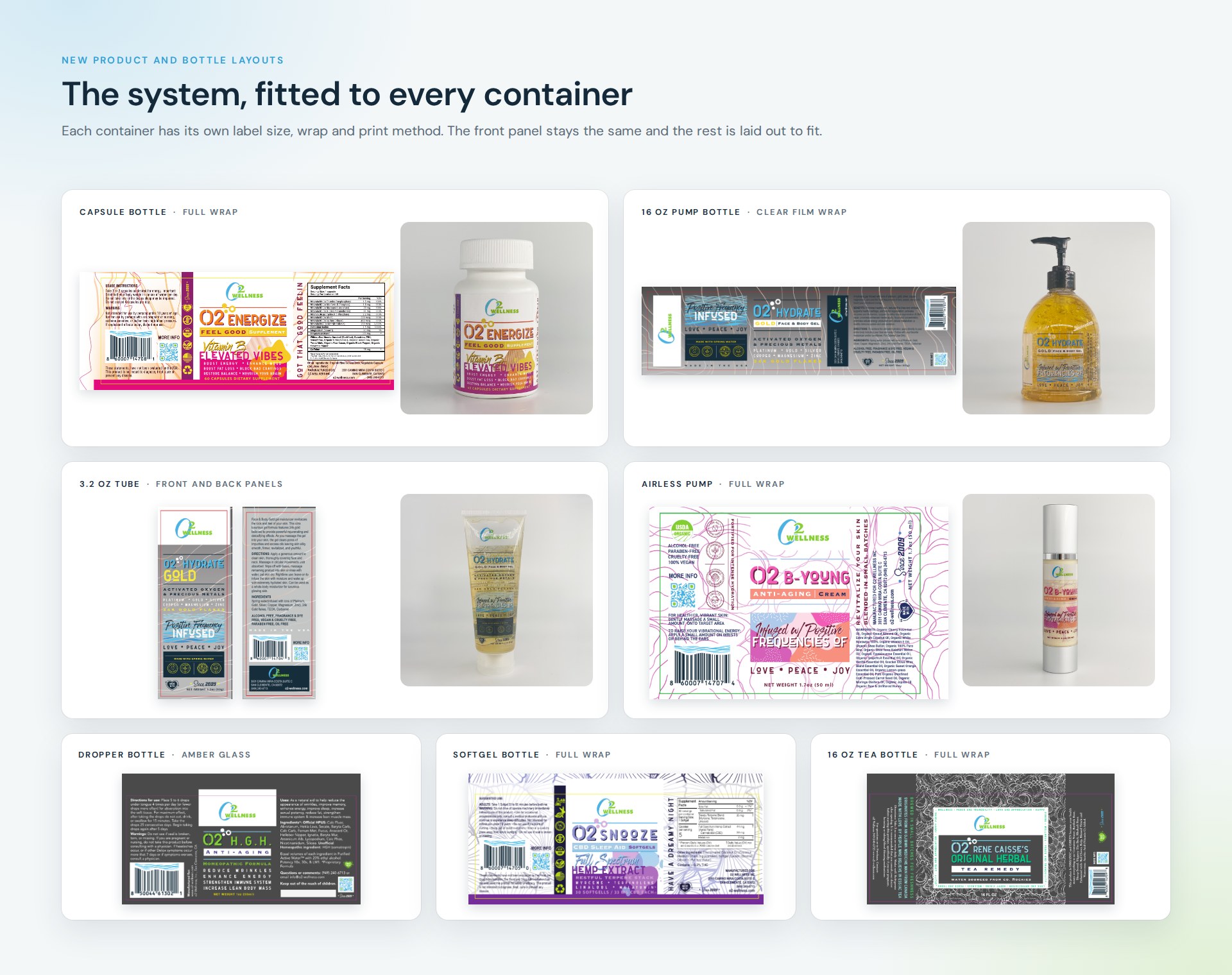
The layout fitted to each container: capsule bottles, pumps, tubes, droppers and a glass tea bottle.
- 06Staging Camp
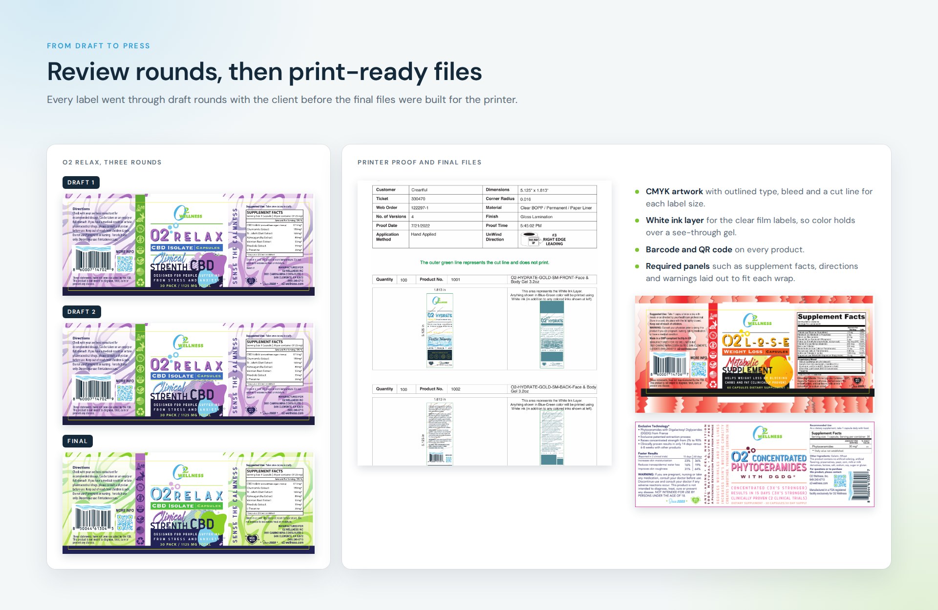
Draft rounds with the client, then final artwork in CMYK with bleed, cut lines and a white ink layer, checked on a printer proof.
- 08Go-Live Summit
Fifteen products, plus line extensions, store imagery and trade show materials.
Task
O2 Wellness wanted its own products to look like one brand. Each product came in a different container, from capsule bottles to clear gel tubes, and new products kept being added. The task was to find a look for the brand, turn it into a label system that could stretch to any product, and deliver print-ready files for every label.
O2 Wellness is a wellness center in San Clemente, California with its own line of supplements, skin care and sprays. The project began with a single gel label and grew into a brand system for the whole range: a revised logo, a shared label layout and print-ready artwork for every container.
Over the course of the work the line expanded to 15 products, including the six-blend O2 Vibrate spray range and O2 Hydrate in two formulas and two sizes. The same system then carried into the online store and trade show materials.
Project overview
Brand discovery
Discovery started from the gel label the client already had. We revised the logo, set a palette and agreed a naming pattern: O2 plus a one-word name such as Energize, Relax or Snooze. The first product, O2 Hydrate, went through six concept rounds to settle the layout that every later label follows.
Label system
Every front panel has the same five parts in the same order: the brand mark, the product name, a category bar, a script headline and a few supporting lines. Color and pattern change from product to product, so each one has its own character and the range still reads as one family on a shelf.
New product and bottle layouts
The products ship in capsule bottles, pump bottles, tubes, airless pumps, droppers and glass bottles. Each container needed its own label size and wrap, with room for directions, ingredients, supplement facts and a barcode. The front panel stays the same and the rest is laid out to fit.
Line extensions
O2 Vibrate launched as six sprays that share one layout and differ only in color, pattern and blend name. O2 Hydrate grew into Gold and Clear versions, each in a tube and a pump bottle, printed on clear film so the gel shows through.
From draft to press
Each label went through draft rounds with the client before final files were prepared for the printer: CMYK artwork with outlined type, bleed and cut lines, plus a white ink layer for the clear film labels.
Launch
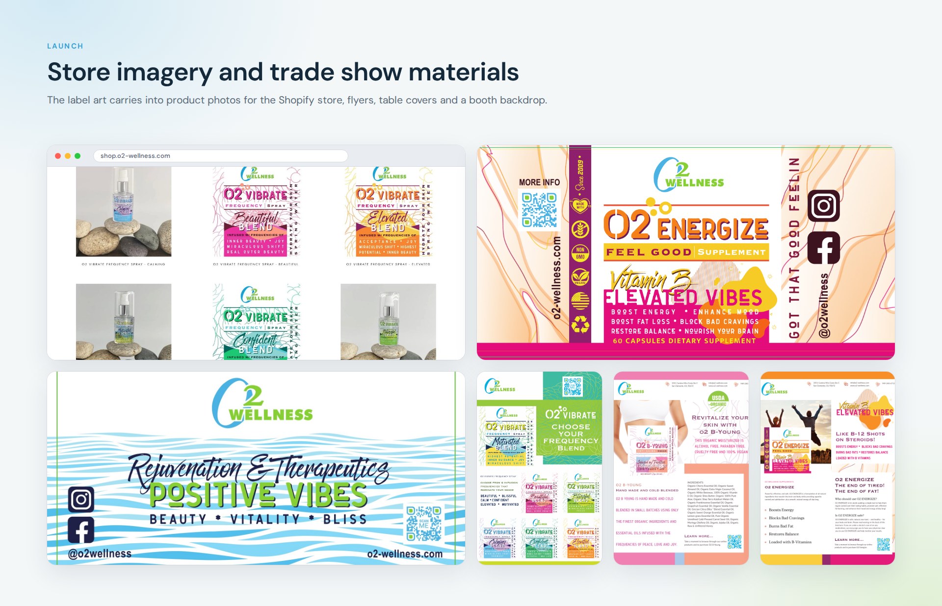
The label art was reused for product photography and imagery on the Shopify store, and for trade show pieces including table covers, flyers and a booth backdrop.